Len recently asked a question about charts with dining survey data ( WHAT DO YOU PEOPLE WANT?!? (In Restaurant Ratings) ). On a parallel track, we’re investigating what we can do with do with our wait time data (both historical data and forecasts) to make them more useful and/or appealing to folks visiting the parks.
To start, we’re focusing on wait times for a specific day. Currently we have this in one spot on our website. What’s presented is simple and looks nice, but we think we can do more.
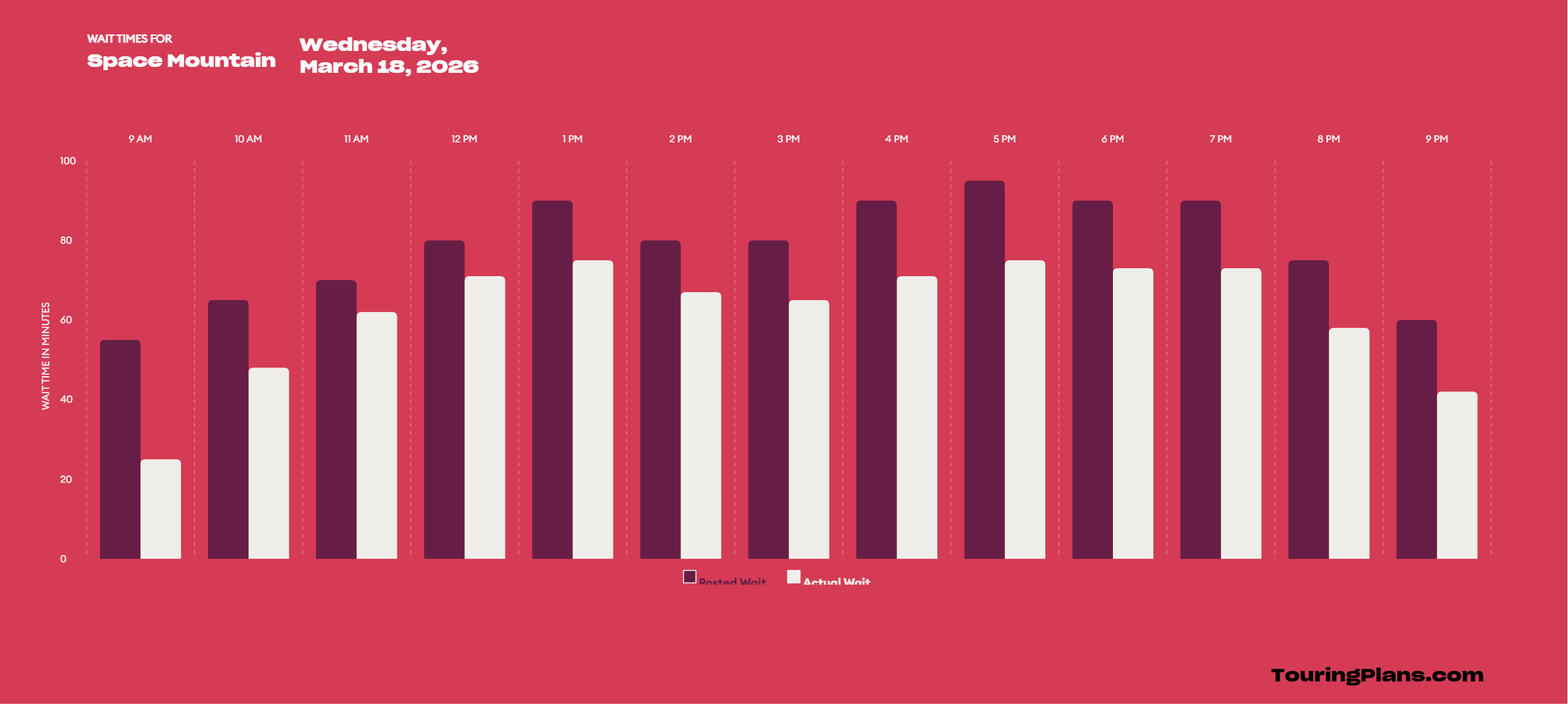
posted wait times (observed posted times from the past, forecasts for posted times in future)
actual wait times (past times from Lines users and staff, our forecasted actual times for the future)
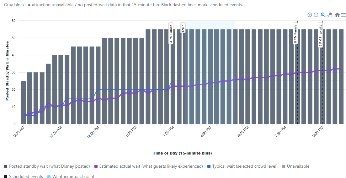
scheduled times of crowd-attracting events (parades, fireworks)
official opening time
attraction survey ratings
weather
sunset
average (or high/medium/low) wait time curves
our predicted (and actual, for past dates) park crowd level
how many Custom Touring Plans exist for this park and date
whether Jupiter is in retrograde
anything else you’ve seen on our site or that we could reasonably collect
Ideas
We can present wait time data as lines or as bars, and we’re likely to use dots to represent the observed waits that we get. Some potential visualizations ideas are below. Ignore colors for now; we can always adjust those later.
What do people want to do with daily wait times charts?
What you care about matters, but I also want to think about what data presentations would appeal to those who aren’t hanging out on this forum. What would be attractive to new visitors? And how would it help us all in the parks?
The line graph is easier on my eyes and I can see, without totally understanding how to interpret the “uncertainty (25-75%)” that my best bet to ride space mountain in a lower time is just after 9 AM.
I love the first visualization (blue/green) - much more attractive and easier for me to interpret than the second one.
The way that I’ve used daily wait time charts has changed quite a bit over the years as I’ve grown more confident in understanding crowd patterns, using LLs and pivoting when things go pear-shaped. Whereas on my first visit I still fully relied on optimizing my TP, I now mainly evaluate the feasibility of a particular route/order of areas that I want to tour.
While using optimized touring plans, the main reason I would view daily wait time charts is to try and spot lulls for specific attractions - or to see from when the wait times meaningfully drop, e.g. “If we skip IASW now, we could come back and do it any time from 5pm because the wait time drops to 15 min or less by then”)
The main reason for which I’m most likely to click on the daily wait time chart today is to see how quickly crowds build at RD or within the first 1-2 hrs of park time. I also check Becky’s data dump for analysis on specific attractions’ average down time at RD - and have sometimes asked her to share her analysis on that (e.g. top three attractions most likely to have delayed opening at a given park). So if you have downtime data, it would be super useful to see it somehow (and ideally also be able to search e.g. for the past 6 months/for a specific month).
Interesting. I would never use these charts myself.
I put the things into the TP and let it do the work. I sometimes try other things, pull things up and down and evaluate. Am I missing some reason to use it over the software doing it for me?
I was a HUGE fan of the old green to red heatmaps. Super easy to understand and view the lull during the day. Would love to see that for attractions. If it gets too complicated it’s beyond the user. I would like it noted somewhere how long the ride/show is. In the App for Ride Now when you tap on description. And in your wait time on your charts. In my mind we’re always asking ourselves, do we have time to get there, ride and then move on to next requirement. Meal/LL
I really like this one. It has all of the data points that I think I would want and it’s clear enough to read/understand. Maybe add some sort of filter so that I could slim down the timeframe if I wanted to see it a bit more granular?
To @QwertySC ‘s point, our recommendation is to use the Custom Touring Plan software to do the hard work for you. If you trust what we’re doing, there’s not a need to go look at what’s going on behind the scenes. For others, these charts could provide validation that we have the data and do the analysis necessary do make our software work.
Having a visual way to show quickly the difference between Disney’s posted waits and what people actually wait is also useful. Plenty of folks don’t understand this, putting undue trust in the wait time posted at the entrance of the attraction.
Beyond that, I opened the question to y’all for a reason: we truly want to know how people might use these (or any other) charts.
One answer might be that you simply like to look at them. If we’ve got enough people like that, that could be reason enough to create them.
I really like the blue/green graph. That’s the data I’d use most, but also would love to be able to toggle on/off the weather and events that you’ve shown in the other graph. For example, Why is Space Mtn lowest at 9PM and not at the very end of the night. Answer: because of the fireworks!
Typically, I look at a prediction chart as I make my custom TP, not a past chart, so the weather might not be particularly helpful in that case.
This - and the blue/green colors - appeals to me more than the bar graph which is too much going on. I don’t need what looks like tall sky scrapers
Here is how I use this information and touring plans. Well before a trip I’ll use the plans to see if I’ve been thinking of too much activity in a certain time frame. My time frames are RD until 11 to 11:30 am and 4 or 5pm until park close/9 or 10 pm. Two blocks of touring time each day, visiting two parks each day. Main areas of interest are when wait times increase in the morning and decrease in the evening. During a trip I rarely use a touring plan and so far, no LLS. I mostly try to zig when others are zagging and the wait times help with that. We have particular ride favorites which we’ve ridden plenty and don’t mind passing this trip if the ride wait doesn’t work. We don’t intend to wait 30 minutes.
As for what would be attractive to new visitors, the first would be that’s a big ask. New visitors bring a range of experiences and objectives. Some of the new visitors I’ve spoken with had no idea there were planning resources. They just arrived, with no previous info as to what’s available in each park. None of the WDW parks are like their local 6 Flags. I can’t recall speaking with a new visitor that had anticipated not seeing everything during their visit, most of which were for 4 or 5 days.
I guess I can’t imagine a new visitor arriving at wait times info without first being very well informed.
I like to see what time of day is best to visit an attraction, or to avoid it. For this purposes, it’s helpful to see a trendline representing a pattern over time rather than a single day.
I like seeing the actual timed waits.
In general I like the design of these charts! Easy to read.
This reminds me that I didn’t mention above that I use historic wait times to decide which time frame for which park. The lowest wait time for a park over a week is when I’ll start planning. Usually start with HS and finish with AK. Then, I’ll do a touring plan to see if all that we think we’ll want will fit in that time frame, adding or removing attractions as needed.
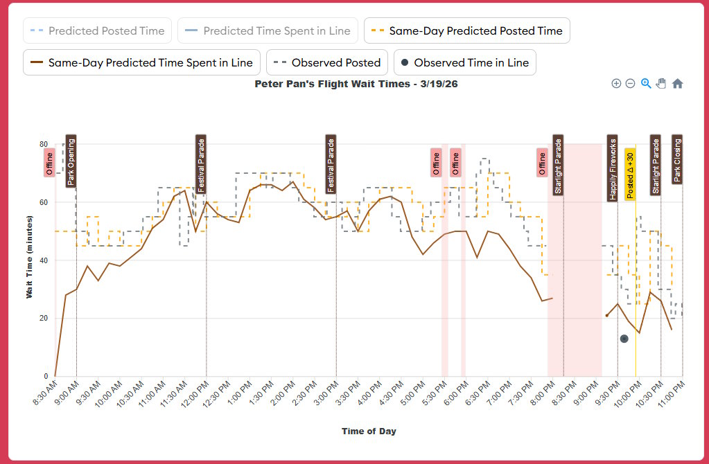
We’ve been playing with wait time charts on and off over the past month, and I’m presenting some additional samples attached to this message. Note that these are attraction- and date-specific charts. We will have charts that show information over time and for entire parks, but those will come later.
Some features:
Park Open/Close and parades/fireworks are shown
Big increases/decreases in posted wait times are highlighted.
Offline periods are highlighted.
Rainy weather (only in 1-hour chunks, so it’s not precise) is highlighted, along with a description.
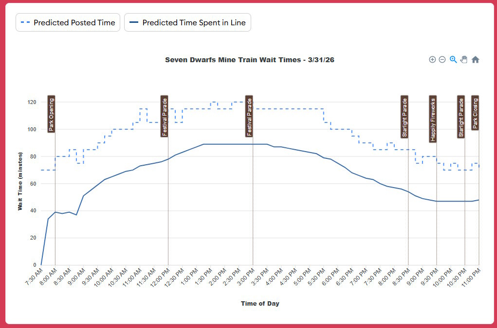
For the future, we show predicted posted times and “how long you’ll really wait” times.
For the past, we show what we observed, along with how we adjusted our forecasts over the course of that day. You optionally can display what our initial predictions were like.
Posted times are shown as a “step” lines.
I have some clean-up to do, but I expect a slightly modified version of these charges to replace what’s on attraction pages soon.
Please offer feedback, if you’ve got any. Is there anything else you’d like to see on these charts? Is there anything that’s confusing?
I really like seeing the parades and fireworks but not sure I need to see these highlighted, just seeing them on the graph is super helpful. Also we will be able to select or possibly deselect which variables we are wanting to see?
I am struggling with “same day predicted predicted posted time” and “same day predicted time spent in line”.
This is to compare the time your pre park day touring plan would predicted, or is this the data touring plans would use to predict crowd calendars? Or both?
I would like to get some context on what I am looking at.
If calendar days are divided into 3 types (prior days, same day, future days) which of those types would use this format?
Assuming that you are plotting Same Day or D(0), and an intra-day adjustment occurs, do you plot the resultant data for the entire day or just the current and future hours of the day?
What causes the intra-day update process to run and how often is it allowed to run?
Why have you elected to plot Observed Time in Line as a point and Observed Posted as a line?
What is the significance of Posted △ +30?
In some cases the Offline band obfuscates the plotted data and sometimes does not. Is that intentional and if so why?
Can you provided a general timeline of how and when the predicted times are modified between their conception at D(n), using a donor date in the past, up to but not including D(0).
The “posted” time is what Disney puts on a sign/app. The “time spent in line” is how long you actually spend waiting in that line. (Often we’ve called the latter “actual” times; I’m not confident there’s a way to describe these that everyone will intuitively understand.).
The “same-day” predictions are same-day adjustments to our forecasts based on observed wait times during a park day. If you’re in the park, those same-day predictions should be your best forecasts for what will happen later in the day.
The “predicted” (not same-day) forecasts for certain attractions are what determine the numbers we put on the Crowd Calendar.
I’m looking at this thread on an iPhone and that is way too much info per chart for me to be able to see anything. I’ll look tomorrow on my computer, and maybe this would be used in trip planning where I do tend to use desktop. But if this is meant to be used in park I think charts have way too much info. Great useful info. But way too much of it.