My personal preferences, yes, but I believe mid-century modern, like Art Deco, seems timeless. Unlike brutalism, which looked hideous and dystopic before the construction was even done. And it always seems to invoke a very particular era that no one in his or her right mind thought was stylish.
1 Like
As a friend of mine used to say “That’s why God made chocolate and vanilla. It’s cool to like different things.”
I’m not into the retro look, so neither TWA nor this do anything for me. But hey, for those who love them, I’m happy for you.
4 Likes
I’m just not into the retro look. Too hipster for me.
1 Like
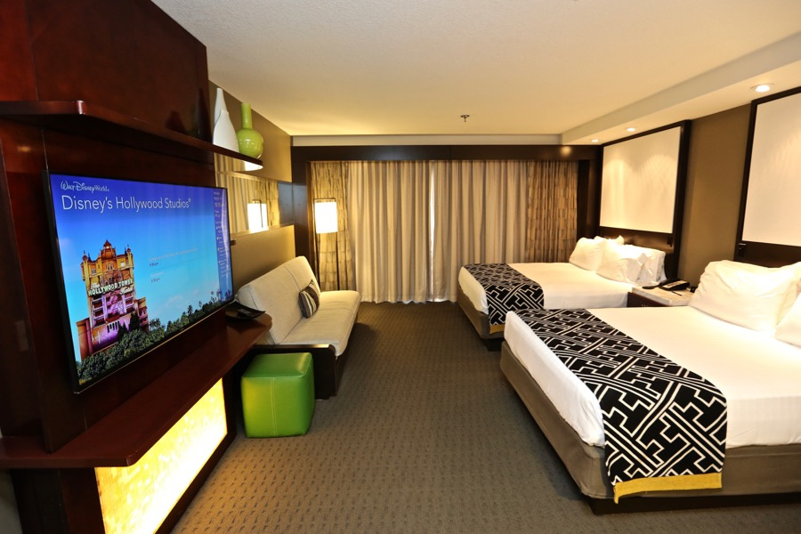
These updates look just like the recent updates to the value resorts only these rooms cost about $500 more a night.
7 Likes
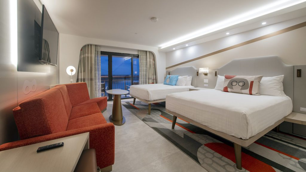
Hmm, I’m not a fan of this. I thought the previous design looked really cool and I looked forward to possibly staying here for the first (and likely only time) in a year or two. But the heavy character design doesn’t mix well for me. Maybe it looks better in person?
Also… is this design going to applied to all the rooms? Or just certain ones? I’ll be booking as close to a standard room is available.
1 Like
Fiiiiiinally the CR is no longer a more expensive Motel 6! Praise be!
I like! I woulda preferred if they had kept the square sinks, though. Theyre really unique to most hotel rooms.
Though… it’s a little heavy on the incredibles thing. Mostly it’s the curtains. Did we need their silhouettes? No. No we did not.
And yeah, sure, I woulda been good with subtle Mickey hints like bay lake does, but I’m just glad “beige and brown” is no longer the primary colors!
7 Likes
Why can’t I sit on the couch and watch tv? 
4 Likes
I love the new look. Would I switch from somewhere else cheaper and pay more to stay there now? Probably not, but if I was gonna stay at CR anyway, I’d be super pleased with this change.
5 Likes
I love this…the old rooms seemed so blah to me and I never had any interest in staying there. This seems to fit the style of the building so much better. I mean if you are going to continue to call yourself the contemporary you better maintain that status and move with the times. Da’ling I would totally stay here now!
3 Likes
Yeah, the only reason I would stay in the CR / BLT is for convenience to MK and only for 1 or 2 nights max. It’s so freakin’ expensive. But if I was in the tower, I’d prefer the new rooms to the old.
1 Like
I like the new look especially compared to the old. It is so much brighter and the lines they’ve created make it look bigger. The pretend clothing hanging in the closet is a cute touch. Is it just me, or is the bathtub unusually long?
1 Like
I think it might be the camera lens they are using.
1 Like
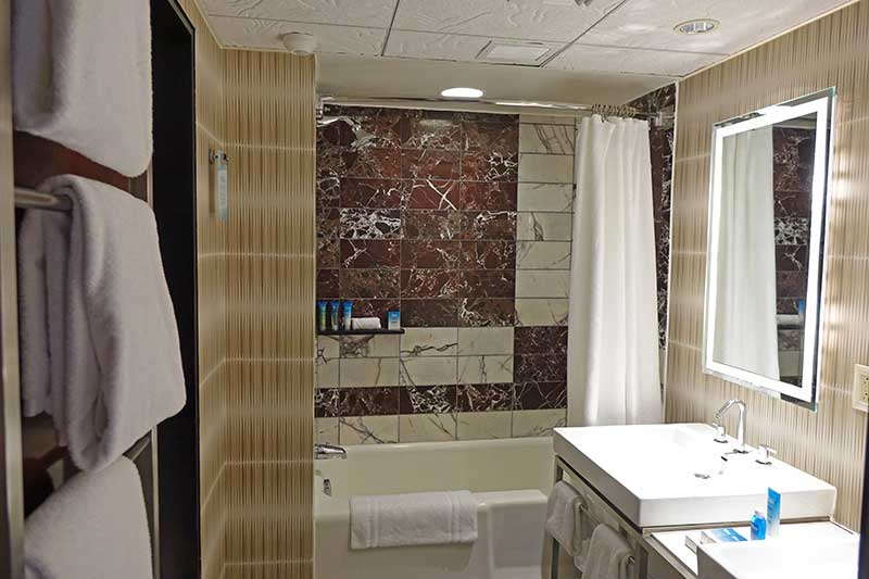

It’s really hard to tell if they’ve changed any of the walls in the bathroom, but it’s hard to imagine they would have, and the older picture looks more normal sized. So I’m with @ryan1 that it’s the camera angle.
1 Like

I was thinking that too, but the round mirror and shower head do not look distorted. That tub look really long and narrow. It’s just weird.
1 Like
I don’t think the original in your first image is the same room type as the refurb one.
1 Like
I really love the wall opening around the window. It completely changes the look and feel of the room.
2 Likes
Ok this is really nerdy of me, but I think in the reflection you get a better sense of the proportions. For one, I marked the wall in orange here, which corresponds to the same wall in the “old” picture perfectly and makes me think the bathroom dimensions / walls were unchanged. Secondly, I marked lines for the open portion of the shower in blue, and it looks much closer to the proportions of the “closed” side of the shower, as opposed to the non-reflection image.

2 Likes
Oh yeah! You can really see it in the reflection of the open shower door. Wow. 
1 Like
That’s what she said
9 Likes