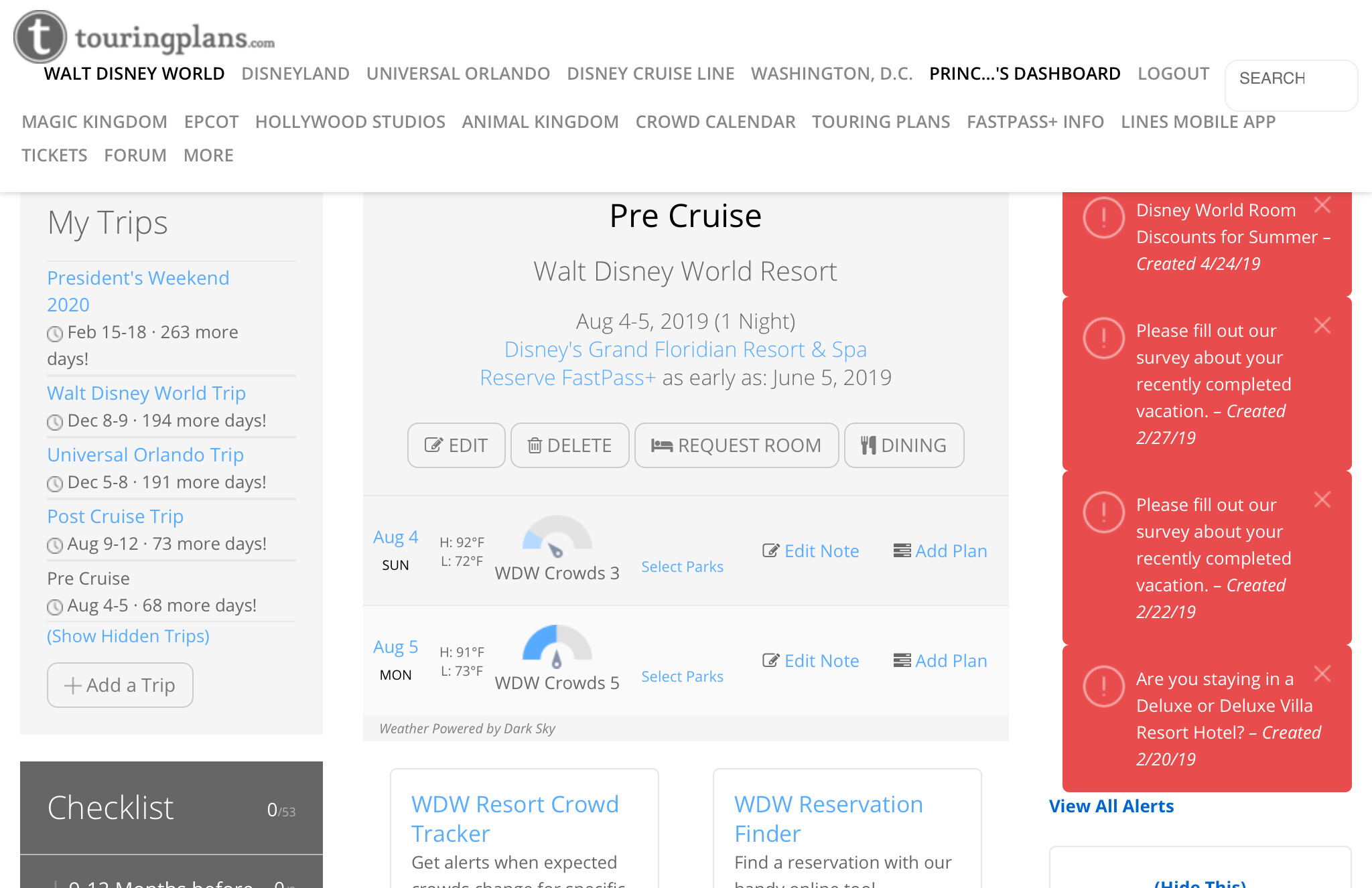
I never noticed the link at the top of the page but I just found a picture of it.
6 Likes
Huh, me either! I always scrolled down and it was in the right.
3 Likes
Me too! I have 4-5 screen shots and I now see it on my dashboard all the way back to 2017. Today is the first day I noticed it.
3 Likes
Agree the forum is a great part of the site! So helpful in planning!
So up until 5 minutes ago, I was seeing the old version of the dashboard, where there were crowd level gauges and the ability to select a park for the day.
I had indicated which park(s) we planned for each day of the trip. I had not made any specific touring plans associated with those parks yet.
I can no longer see which park I planned for any day. Where did my info go?
I have clicked all over the new dashboard and do not see info I previously selected.
Can someone point me in the right direction?
Thanks!
2 Likes
The only place I have been able to find mine is in the app. I cannot find it on the new webpage.
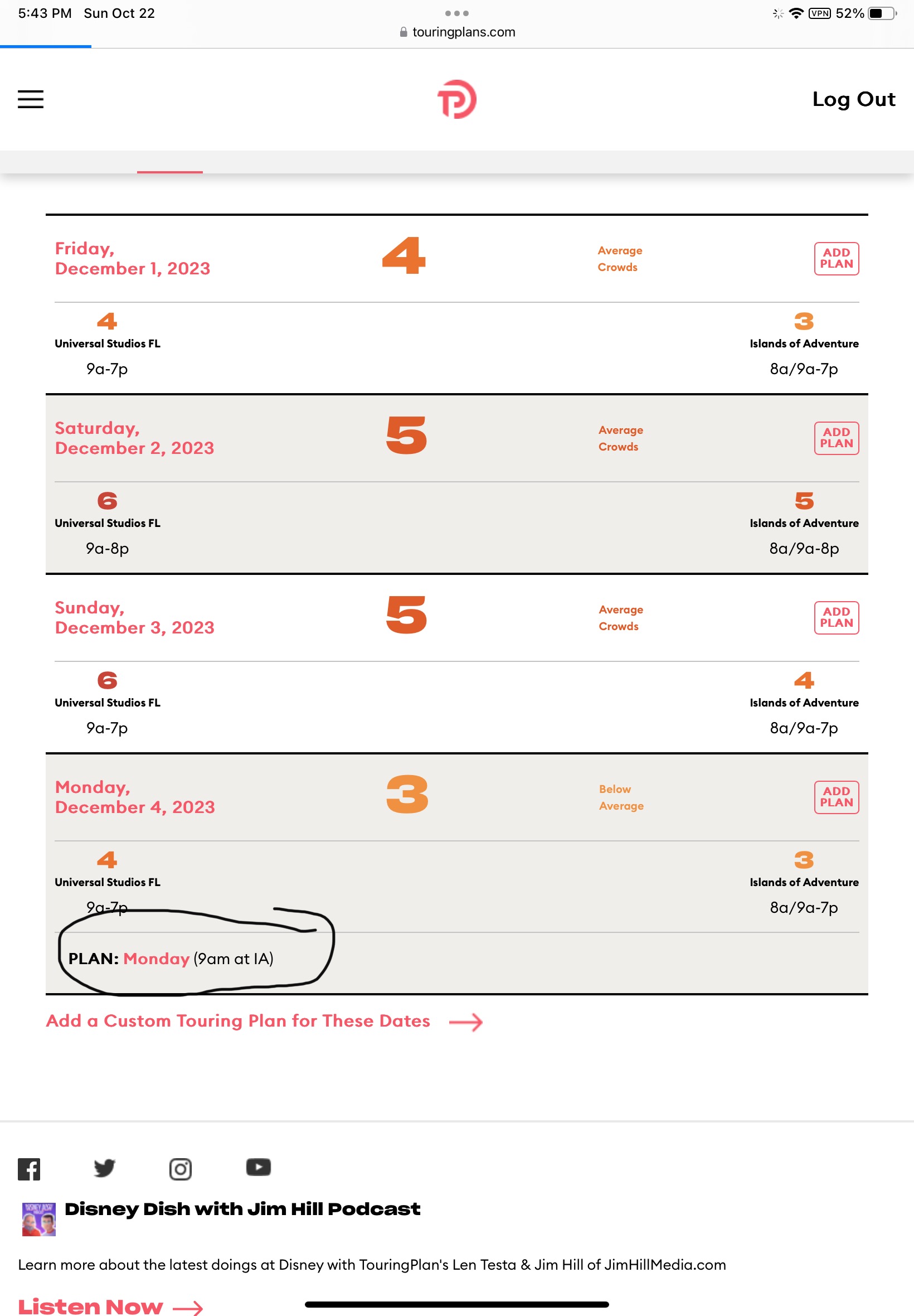

I can see my plans for that day, but not the park I decided to visit that day. I really like seeing my park choices laid out for the trip - more than I thought I did!
2 Likes
Here is the difference visually:
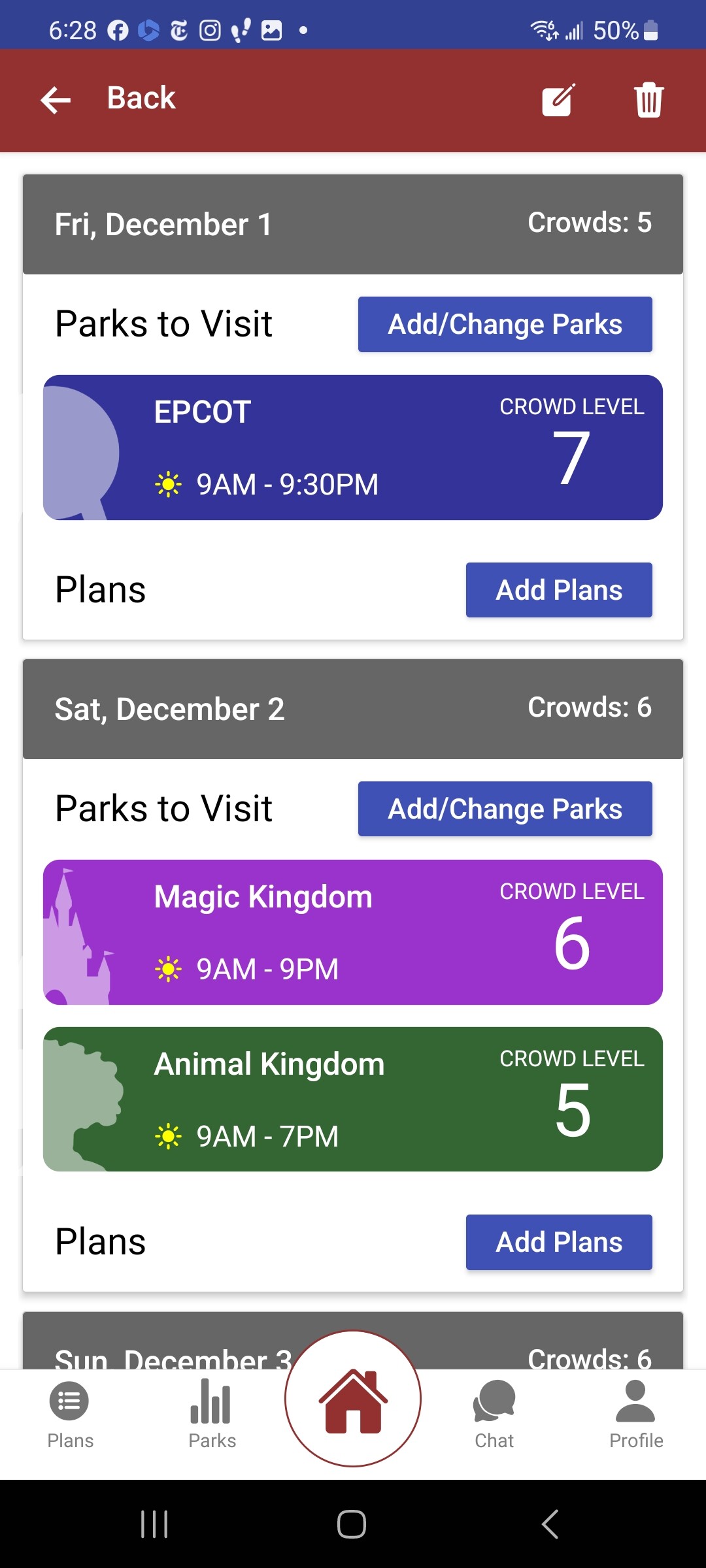

The new website only gives you general crowd information and the app is specific to your plans. I liked having that personalization on the website. I switch my park days around so much when planning, I always rely on this page! If you could add a square around “your parks” for a day, that would do it for me.
3 Likes
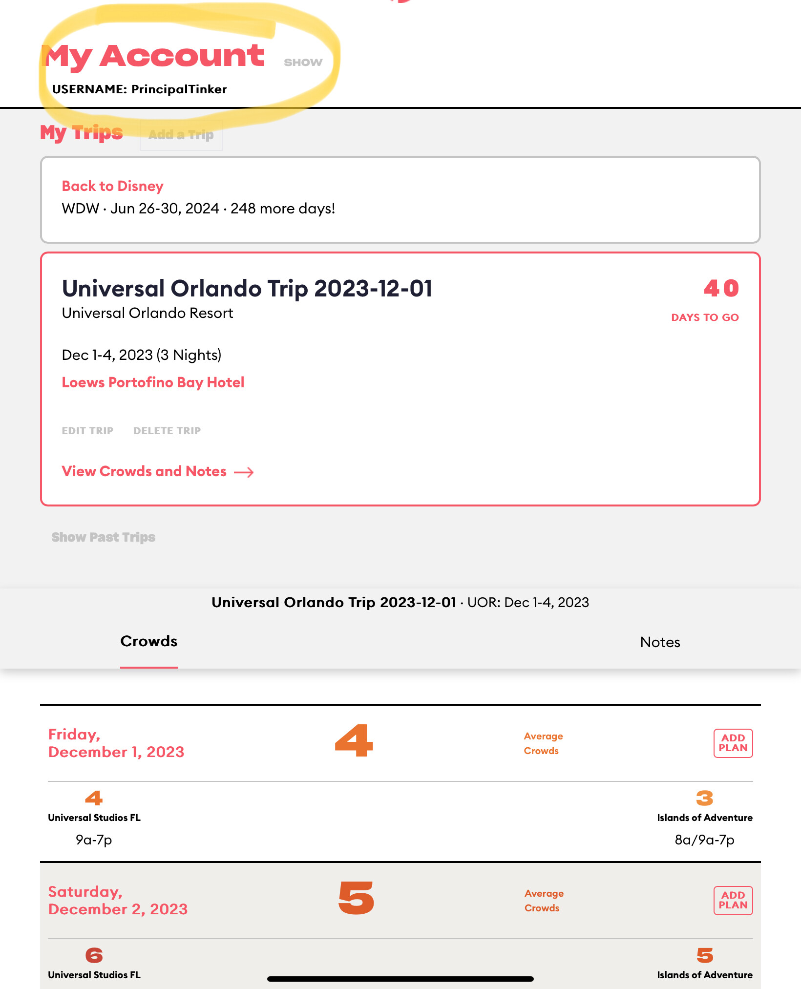
Your plans would also show what park they are for. My plan shows it is for island of Adventure (IA)
I appreciate everyone’s help.
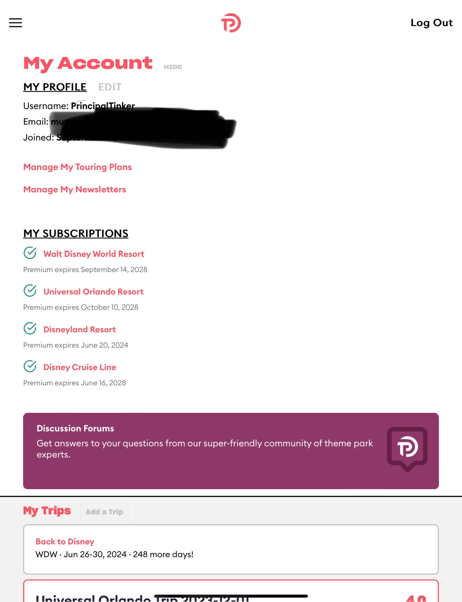
My dashboard looks like the image PrincipalTinker posted, but without the park of the day info.
I had already indicated which park on which day on the old dashboard.
But the information has disappeared.
1 Like
I am 100% with you.The picture on the right is the new website and all of my choices are not visable. The one on the left is in the app - so you can still see them, but I agree it would be nice to be able to see it on the website dash board (i updated my post to make it more clear).
2 Likes
I just checked on the app and I can see the parks I selected. Thank you!
Now that I can refresh my memory on the choices, I will “make plans” on the website version.
Old dog here, constantly having to learn new tricks.
4 Likes
I also miss seeing my notes next to the parks I picked for the day. I was using them all together to remind me of how I wanted to plan. I would appreciate seeing all together again in the web version, which is what I am using for planning.
6 Likes
@heathernoel Does your app still show the parks sectioned by date like the left hand picture? All of mine (in the app) are just in a big mashed up list. I am finding this change very difficult to use. The UX is not good, even though the UI is is prettier. Functionality is my first priority!
1 Like
When I view the details of my trip, I can select and pin days in that plan- on the app.
1 Like
While there are definitely UX improvements in some of the changes, I do feel the UX decisions were focused first from a graphic artist perspective, over function. (I have a son who got his degree in UX design, and he did mention this is a common thing.)
I wouldn’t say that the UX is “not good”…but there are some things that I think, as you say, puts too much emphasis on looks over that function.
Part of it is learning curve though. I am curious for myself how I end up using it in a real world trip planning, versus just theoretically as it is now.
4 Likes
Well, as an IT leader, I would agree with your son and would go as far as to say when the user experience/usability is this challenging, something has been missed. Having said this, I appreciate the forum to give feedback. As a west coaster, Disneyland is our home park, we know it well and do not need a plan, so I have never attempted to use TP before. The data science driven approach delights me and prior to the changes, I was enjoying the interaction.
3 Likes