I’d consider myself a “pro” at the traditional TP dashboard. Let me say… it took a lot of years! There’s too much on that page. It’s overwhelming.
I enjoyed the new pages so much more! Nicer layout, easy to read, detailed with out vomiting a bunch of text / info all over the page!
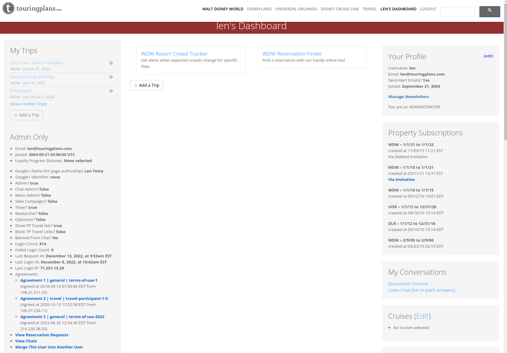
I rarely use ANY of the stuff in the “My Trips” / “Your Profile” vertical sections.
I go often now, but when I didn’t I only had one trip a year. I didn’t need to see a list of every TP I’ve made for the entirety of my account’s existence.
Also, I was on TP in 2012 - 2013, I didn’t find these forums for almost 5 years! That “forums” tab at the top is so hard to find. The people on these boards have been my greatest resource! Make it easier for new people to find this section.
I still HIGHLY prefer to make my TPs on a PC. The App still isn’t perfect and I find the ability to edit and move things around a 1000 times easier on PC
I like the trip countdown. I would also like to list trips that aren’t WDW and see those countdowns as well (I currently just list them and call them WDW).
It didn’t take me 5 but it did take me 2 years to first find the chat (I migrated to forum from chat when that happened in the olden days). But yes, agree that the boards need to be more forward-facing for users because it is such a great resource.
I would like to be able to delete old trips. I know you can hide them but they are still there. There was a trip pre Covid we were going to take, then didn’t. The date is past so delete is no longer an option. The only way to remove it from view was to hide it. It was very emotional to cancel etc and tbh seeing that trip still there when we didn’t go on it is a bit triggering.
I think the updates look really great! I do kind of miss the trademark burgundy TP logo though. As far as functionality the things I most want to be able to see and do easily are:
Crowd calendar
Crowd tracker for my trip
Trip itinerary with countdown
Reservation finder
Room finder (this process is kind of clunky)
Forums
Blog
Detailed dining information for all types (qs, ts, carts)
Detailed ride information
Wait time data for individual attractions
The ‘what we predicted vs how we did data’
Blogs also. I would like to see better navigation to blogs. I like to read them but forget honestly. I would like to see it on my dashboard page. Like I can scroll down and find forums.
My fave blogs are the ones about the festivals or parties with TP tips, food reviews, etc. And the ones about new things like Galactic Starcruiser. Stuff that there may not be an official touring plan page for like the attractions and entertainment.
I don’t use the Destinations blurb at all, I get thru it from the top. In all honesty, I really use nothing on the right except the personalized tp link and if you send me reminders on the top right.
My Trips.
Agreed, I don’t need to see past trips. It’s a nice to have them to reference. Hiding them is a nice option. However, that’s another step a user has to take.
Could you have that area only show current/future date trips with old trips under a “Show past trips” selection?
In addition to “Hide Trip”, give the user a “Delete trip” option.
Checklist
I’ve done enough trips that I don’t need this necessarily. However, it’s good for new travelers or to have the satisfaction of crossing things off my list.
Profile and Destination subscription information isn’t referenced regularly so it could be moved to a less prominent area.
I’m just realizing the forum and chat links are on this page. That could be moved to a more visible spot.
From a trip dashboard perspective, I like the information shown currently.
It would be nice to have countdown on the main dashboard section.
What about a drag and drop widget space where the user creates their own dashboard with what they want? There could be a default one to start off with, but hide the things not wanted and pin the things most valuable?
90% of the time when I come to this page it’s to see my countdown. So make sure that sticks around.
My main bit of feedback would be to have a clear link to the Forum and Blog from the homepage, at least in a submenu. A lot of the time when I’m navigating the website, I’m going between those three areas.