To clarify, by prototype I was just meaning the stuff Len asked us to try out.
If I go to the website now and create a touring plan, is that unchanged from before the redesign? Since I can’t see the new design I don’t know what is different in the new version.
Hopefully they can sort out the mess around the plan telling you to book your next LL. I just want to guess what LLs I’ll get and tell the plan. rather than being told to book Disney Jr at 7am.
Is there still no way to circle/highlight the parks you intend to visit on the Crowds and Plans tab of the dashboard? Somewhere back a way in this discussion, I thought I read that it would be added. It would be super helpful!
We have a set of updates about ready for our test environment, which should address many of these things. I’ll have the full list shortly. Please continue to suggest improvements!
For my planning, it would be helpful to be able to select the water parks as my park for the day. Is there any chance of adding that?
BTW just saw the new changes to ‘my plans’ and like them. I haven’t played with them yet, but the view of the plans I already had set up looks much easier to read . Thank you!
I made my touring plan and historically, I’ve been able to see the steps in the map after I optimize. But right now there is just a map of the park with no steps in it.
Anyone else?
I just created a test plan for MK later this month. It shows the step numbers on the map. It did that at all stages - after I had selected things but not yet optimized or evaluated, then it showed after I evaluated, and lastly it showed after I optimized. It even shows on the printed copy. I’m on a PC laptop.
The site has definitely been acting quirky lately. I’m finding I have to refresh the screen to get everything to load properly after optimizing/evaluating. I have a feeling there are still some wrinkles to be ironed out.
@Broph1988 - if you don’t mind, please open a ticket at touringplans.zendesk.com by clicking “submit a request” in the upper right corner of the page. A screen cap of what you’re seeing before and after the optimization would be helpful. Thank you!
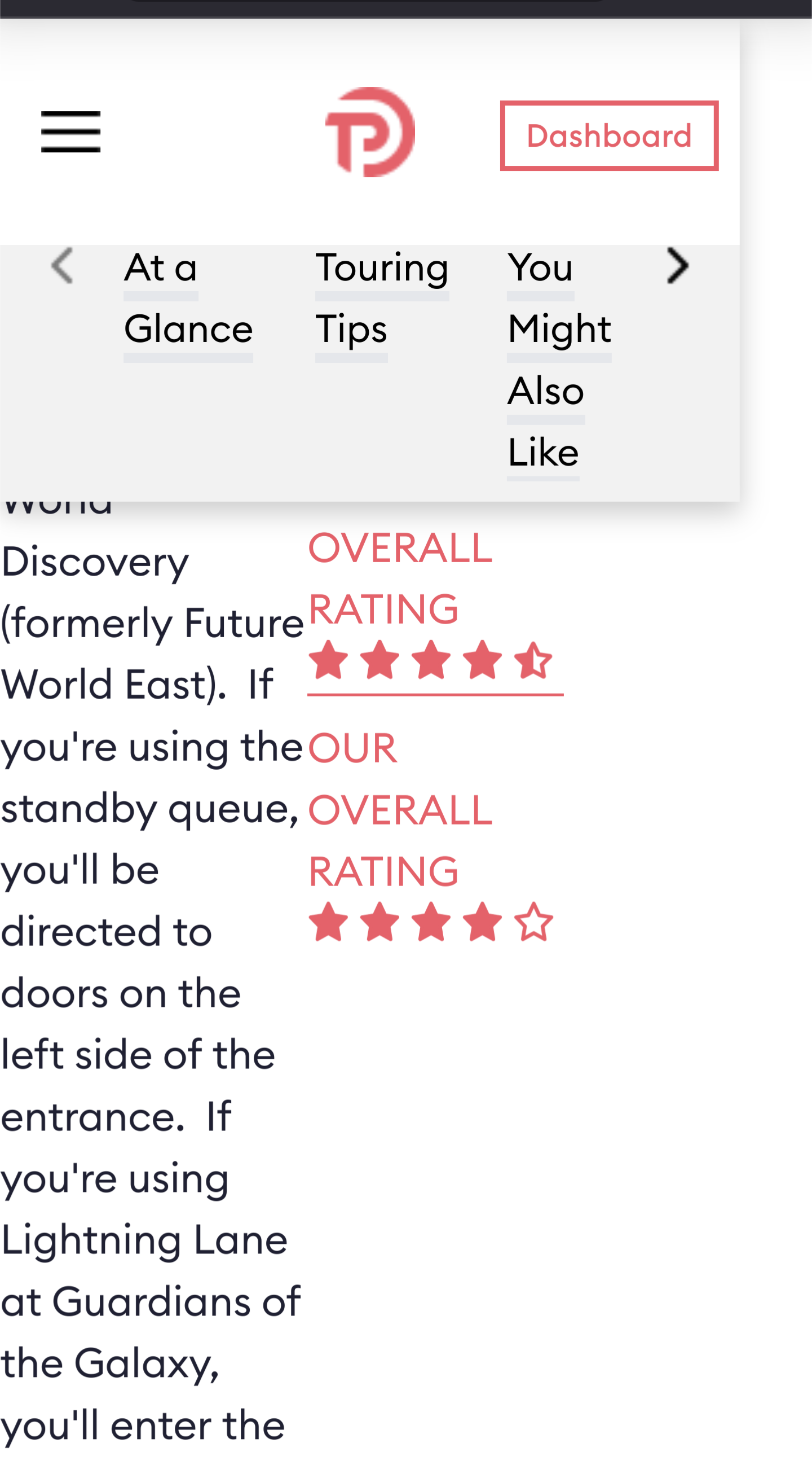
I’ve notices a lot of awkward white spaces with this new design. It looks like blocks are using 50/50 splits (columns??) and one side is sometimes much more filled then the other, creating a lot of white space. Like in the example of ride description.
We’ve added this to our punchlist. @drvillarejos if you notice other pages, let me know the URLs, please, and the device you’re using. Happy to make adjustments.
That definitely is not what we want the attraction pages to look like.
@FelisLachesis would you please let us know what version of Android and Firefox you’re using? And do you get the same experience on the latest version of Google Chrome? Maybe also clear your browser cache.
We want to try to replicate this issue so that we can fix it. I can look at Guardians of the Galaxy: Cosmic Rewind | EPCOT, and “At a Glance” text takes up the full width, with the rating info going underneath it. It seems like your browser isn’t handling our page as intended, and I want to find the cause.
We do have some situations where we have an unexpectedly long amount of text (e.g., 9 paragraphs is a very long “glance” in a section called “At a Glance”), and we may have some strangeness there. I think long summaries of hotel restaurants can make things ugly on hotel pages. If you notice anything like this, let us know. We want to make the site better.
Will do! It seems the old site had it’s columns more balanced, even they were the same width. One may have taken up 2/3s of the width and the other 1/3 but the height was the same, cutting back the white space and cutting back how much scrolling to get to the sext attraction, section, etc. I hope that makes sense. I don’t build websites. I’ll be vigilant this weekend and report back.
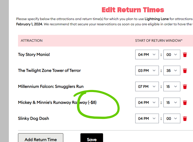
Hey David, great to see you here. Just thought I’d share this. There is still a cost attached to MMRR. This is under the advanced options, configure additional return times.