- It’s fabulous
- Meh
- Put it back the way it was and get off my lawn
- They changed the color?
0 voters
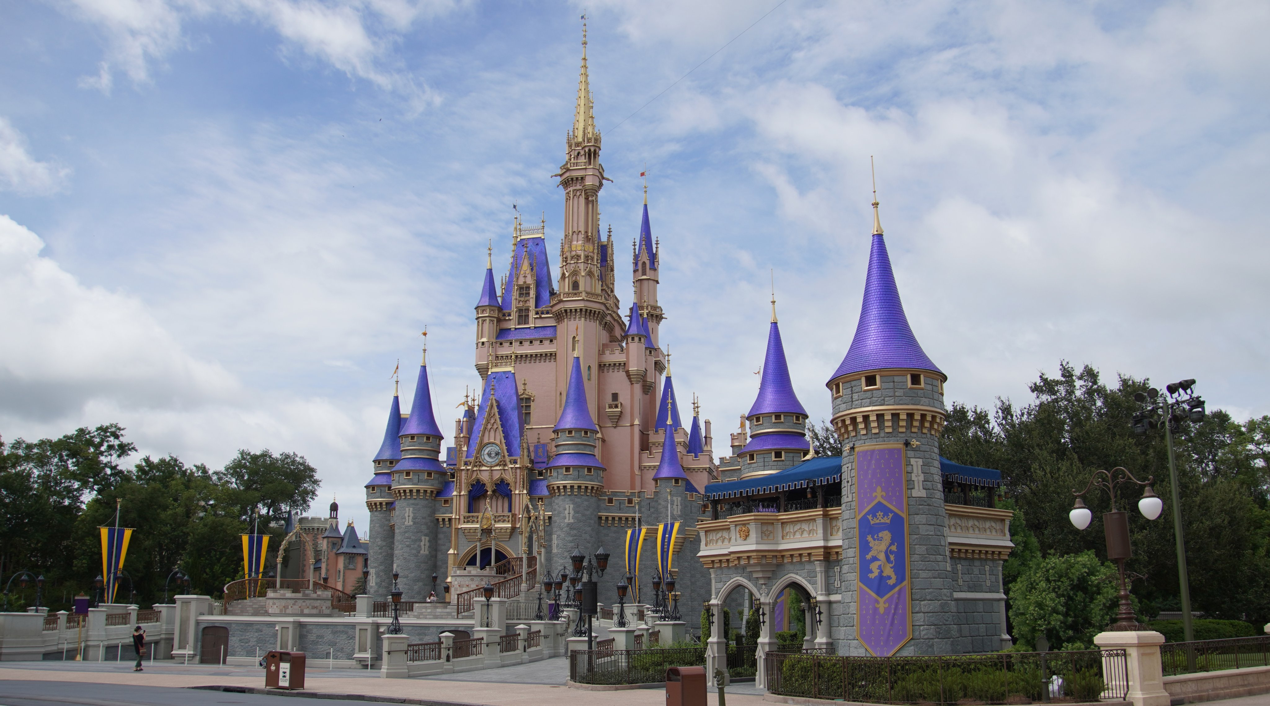
Photo from @bioreconstruct on Twitter
0 voters
It grew on me a little while we were there, but I still don’t like it much. It looked 100% better before they changed the colors. That pink/salmon color needs to go!
I didn’t like it the first time I saw it, but it has gradually grown on me. I think the old gray was too brutalist. They could find a slightly better hue, but I imagine it will fade with time anyway.
Also I agree with those who have said the roof tiles are too purple - should be more blue.
But overall, I like it better. So sue me.
Also just want to add the original artist’s rendering of what it was supposed to look like. I like this peachy pink better. Maybe it will take a few years to get back to that.
I got used to seeing pictures of it but when I saw it in person it really turned me off
I think that it might look good once it fades in the Florida sun?
I thought maybe I would get used to it in person, but I didn’t. It isn’t horrible. But the old colors were much much better. It felt like a toy was hit by growth ray and left there. The old castle looked like…well…a castle.
And the purple is a little less bold in this rendering. I would like an indigo vs a bold purple, lol
for comparison:
color from 1995 (Similar to the original color in 1972)
Oooh I really like the blues and golds in the 1995 pic. But the gray is too bland. It needs a tinge of color.
In a few years it’ll be something else.
The new paint job ain’t horrible . . .
I would like the current look EXCEPT Blue instead of Purple
I like the artist’s rendering, but not what I am currently seeing in photos. Too loud.
Castle = Cinderella’s place
Cinderella = gentle, softspoken
Current color = Genie blue
Genie = loud, out there, enormous
Castle should match character. Blue needs to be Cinderella blue. Gentle, softspoken.
I hate it.
IMHO - it now looks too much like the other castles in the other parks. They should each be distinct based on the castle’s residences.
I’m a “meh” voter. It’s not the end of the world for me, but I did prefer the older color
I like your argument. I wonder if the castle is an expression of Cindy’s inner child? 
I like the pink but I think the gray looks weird.
I don’t hate it, but I agree with many of you on here, it just isn’t quite right. When I went to WDW for my first trip in May 2019 I was underwhelmed by the castle. I think the light gray paint against the gray sky lacked a certain “wow” effect for me. Yes, it is much larger that the one DLR, but because the scale of the park and the area around it, is so much larger as well, it did not “feel” much larger. When taking a picture with the WDW castle, I felt it got lost in its subtlety. I feel like it needed something different to standout from the blue or gray of the sky, but not a purplish blue. I also agree, they should make each castle unique and distinct and it appears that they are almost creating a uniform look for the various castles and that is disappointing.
The shiny ultra-bright purple-blue looks weird on the grey. I don’t even know what to say about the gold. It’s a gaudy top on a bland base. Just really odd to me.
Ultimately, I suppose it doesn’t matter what we think of it…Disney isn’t likely to refurb the castle again for several more years. So, we’re stuck with the new look for a while. At least it isn’t a giant birthday cake!


