Here to test for Wilderness Lodge! Using iPhone.
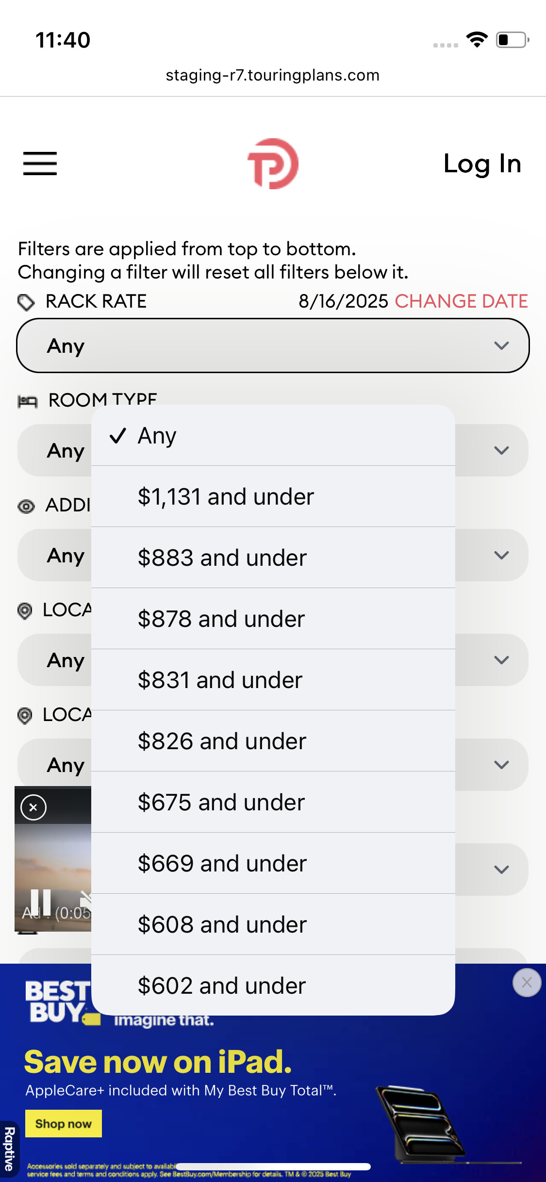
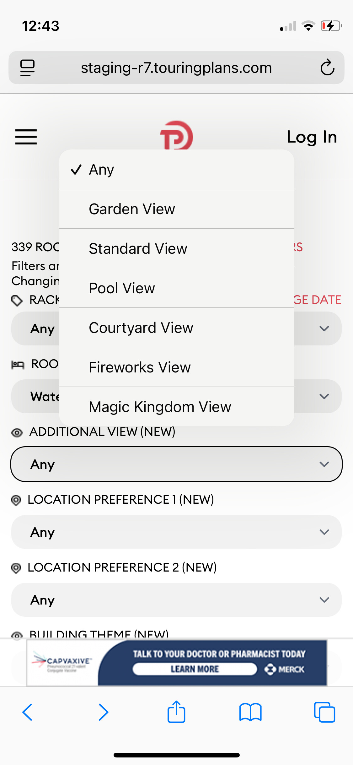
The Rack Rate categories for WL are plentiful and strange, some with only $5 difference from the adjacent categories. I would think you could collapse and standardize across the board for all hotels, picking ranges that make sense to people - e.g. $199 and Under, $200-499, $500-999, $1000-1999, $2000 and Over (and graying out categories that don’t apply to certain hotels, like graying out the $199 and under for WL). Unless the very bespoke rack rate configuration is meant to match with Disney-tracked data points.
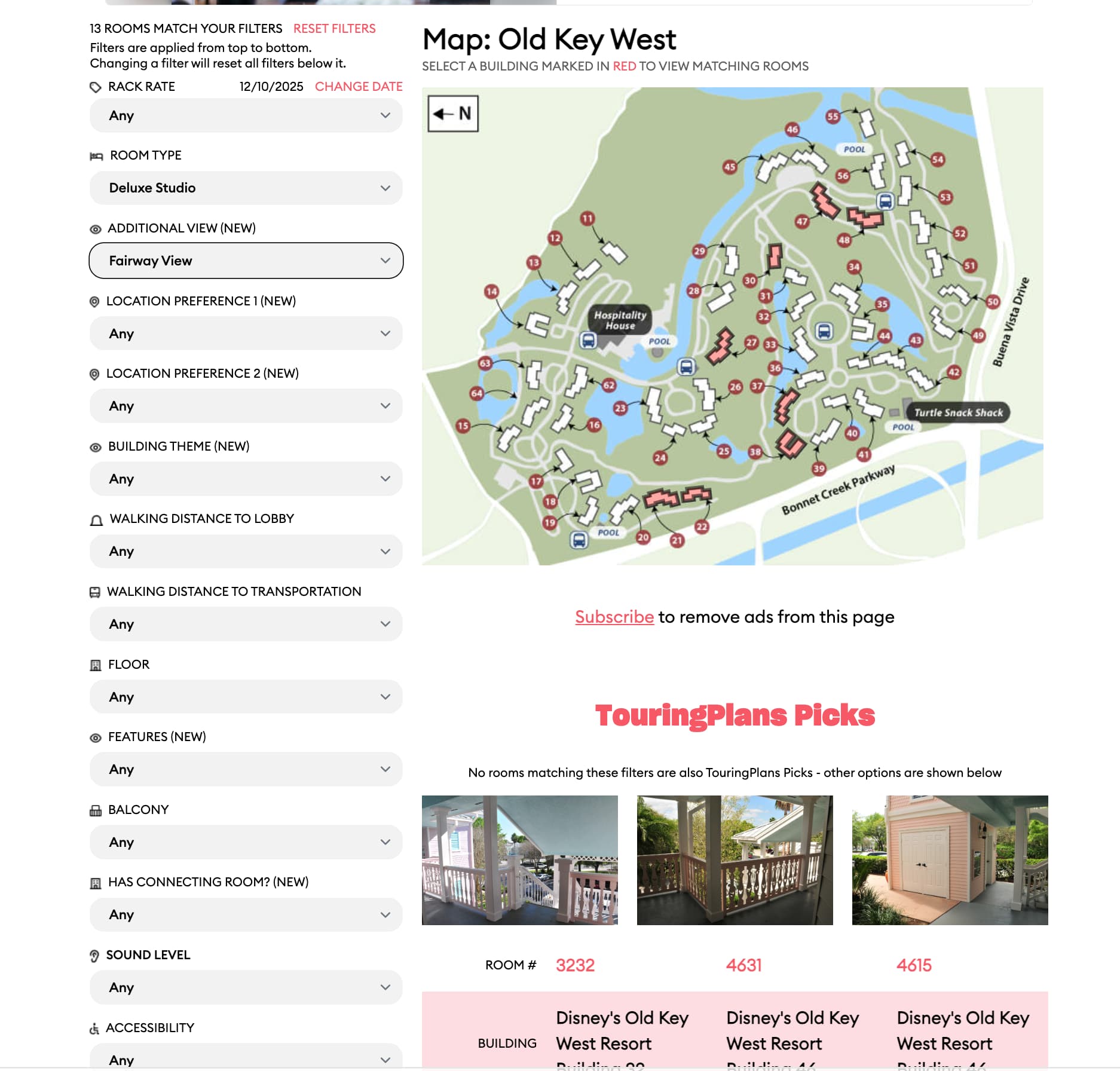
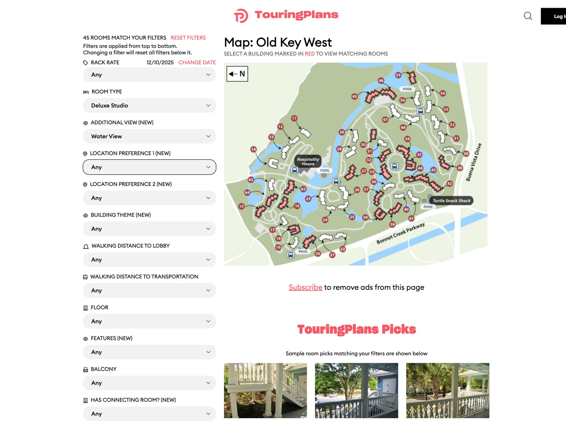
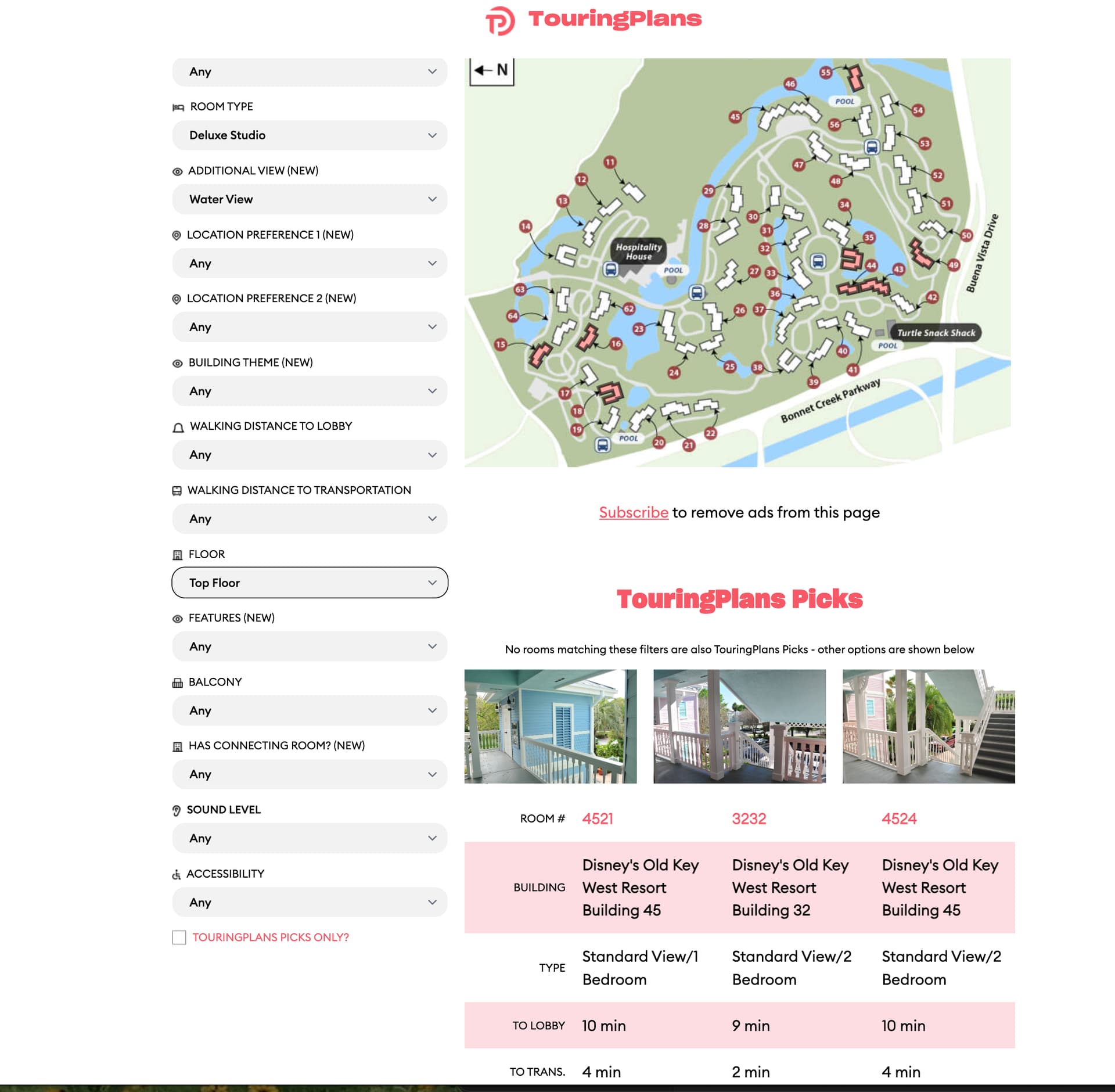
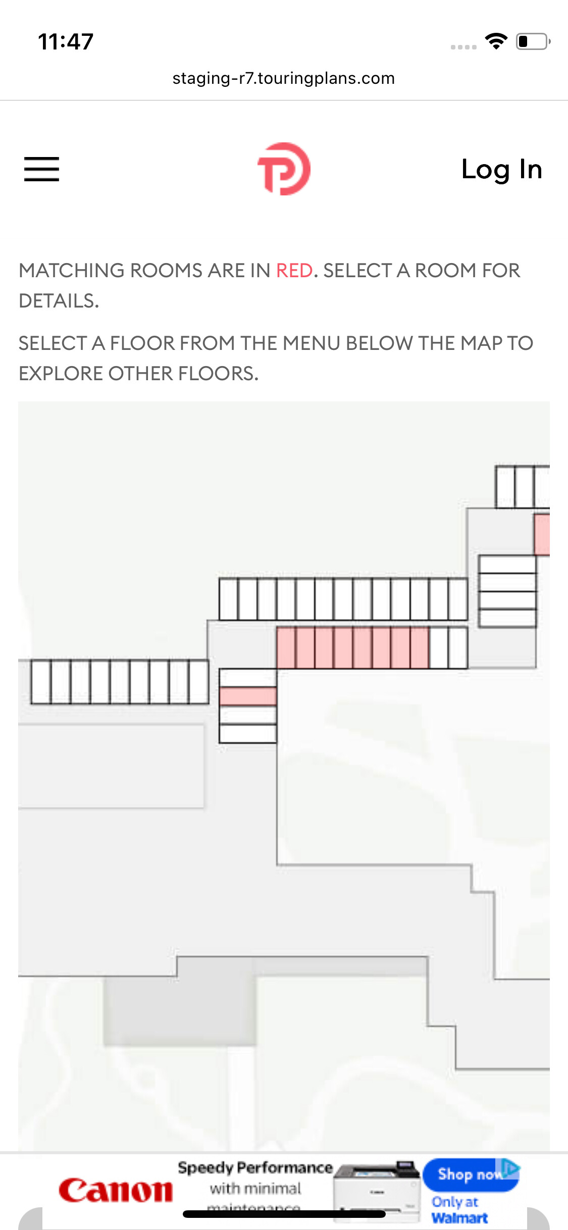
The actual hotel room map of WL can only be scrolled horizontally and vertically within its frame, it can’t be resized smaller within the frame by “pinching” it. Is this true for all hotel maps?
Re: the actual map: not so much bugs, just observations:
I would appreciate if there were symbols on the floor map to show where the elevators are, and where the lobby is (especially as those are two features you can select). For instance, it would be helpful to see on the WL map that there is an elevator bank halfway down the long hallway. Could indicate what floor the lobby is on, for hotels like AK and WL where it’s not the 1st floor. Thinking gray italics over the general area with “Lobby (2nd Floor)” or “Overlook to Lobby (Lobby on 2nd Floor)” kind of thing. Doors to outside could be indicated in some way as well, like little bitty crescent/door swing line or a thicker line or mini exit sign, so you could see whether there is an exit at the end of a long hall and if so on which floor. Maybe even a little arrow with “To Dock” or “To Bus Stop” on the outside area near the appropriate exit, as transport is also an available feature. Easy helpful things that don’t add too much clutter but help to orient people.
I would also prefer the Floor dropdown display to appear above the map rather than below it when viewing from iPhone. Maybe just below the italics that say “87 matching rooms in this building See Floors 2, 3, 4, and 5”, put the floor dropdown to select floor and keep with the text that says “20 matching rooms on Floor 5”, and then follow with the rest with the info about matching rooms in red text and the map.
And then specific to WL, I do find it odd that you can’t “see” the Copper Creek rooms that are on the other half of/across the lobby in this same building, even as a shadowy elephant graveyard on the room map. Maybe there is a way to make a very light outline of the rooms with a gray italics that this is Copper Creek, and perhaps a link to it with a popup warning box and “ok” button to confirm that you are leaving the page for WL. Saves clicks on going back to the resort page when the whole floor is shown but only half of the floor (WL side) looks like it even has rooms. I feel like on the map for AKL Jambo you can “see” the DVC 1BR etc. with the regular rooms because they are in the same hallways?