I like it! I think a link to WDW website would be helpful, as it is where I would book.
Maybe comments about how kids vs adults liked it? Or age? Similar to how it’s rated for the rides.
I second vegeterian/vegan friendliness!
I like it! I think a link to WDW website would be helpful, as it is where I would book.
Maybe comments about how kids vs adults liked it? Or age? Similar to how it’s rated for the rides.
I second vegeterian/vegan friendliness!
I have strong thoughts on why that is. I went to Takumi-Tei on Saturday and it was wonderful.
Primarily, I think it’s two things with the rating:
I may follow up with those who’ve rated it, to see what was driving the rating. I mean, there’s nothing wrong with the food quality, presentation, or setting.
And the last 3 reviews have all been thumbs-down. ![]()
Maybe you should post your glowing review.
I’m not sure I knew you could put something through this test! I do worry about people with low vision too.
I think there is a lot of sway in the “value” aspect of choosing a place to eat, particularly in the last year or two, where people are much more annoyed at the nickel-and-diming and rising prices all over WDW. So, I think the price is likely weighing down a great many really good restaurants…AND, I think lower cost food can raise the overall rating of a place with mediocre food.
I remember a few years ago, noticing that about headphones/earbuds on Amazon. These cheap wireless unknown brands were getting 4.5+ starts. But JBL or Bose earbuds, which were clearly WAY WAY better in terms of audio quality were getting ~3 stars. Why? Because people expect way more from earbuds (or anything, really) when you are paying $200 versus $20. Pretty soon the “overall” ratings become a bit meaningless as a result.
Not sure how to “fix” that when it comes to subjectivity.
I’ve got emails in to the last half-dozen people who went there and didn’t like it, asking for clarification on why.
It’s a must for UX/UI design. Accessibility is a big thing.
That is something important to consider. I wonder if there are filters you can run it through to test for that. ![]()
Heard back from a couple of folks. It’s cost.
I think if you wrote the “at a glance” to read something like “exquisite food and service for true connoisseurs of authentic formal Japanese cuisine” it might set expectations a bit better.
I personally like the price on a $ to $$$$ scale as well since that is easier to see at a glance than to read “Expensive” which I may have skimmed over. Maybe combine? “$$$$ (Expensive)” or “Expensive ($$$$)”.
This change would also help to put it in context to a relative scale since most people would assume/know that the scale goes to 4 or 5. Curious though - is Expensive the highest or is there a “Second Mortgage ($$$$$)” category for V&A?
That’s fancy! Visually it’s appealing and an upgrade
BOG is meh*. Haven’t tried Takumi Tei. I wonder if it’s since it reopened its struggling?
*it wasnt always meh but it’s steadily gone downhill imho.
I absolutely love this! The color, layout, typography, and composure are all on point.
Of course, I have a few minor nitpicks.
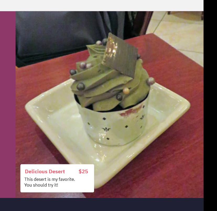
This is, I believe, the single most important nitpick: annotate your food images! You don’t want people reserving a restaurant to order an item they have to guess the name of.
Every image should have a caption with the name, price, and a short blurb about it. Here’s an example:
I also highly recommend you convert the menu design to prioritize images (say, a grid rather than a list). For lots of people that visual connection may be the straw to break the camel’s back.
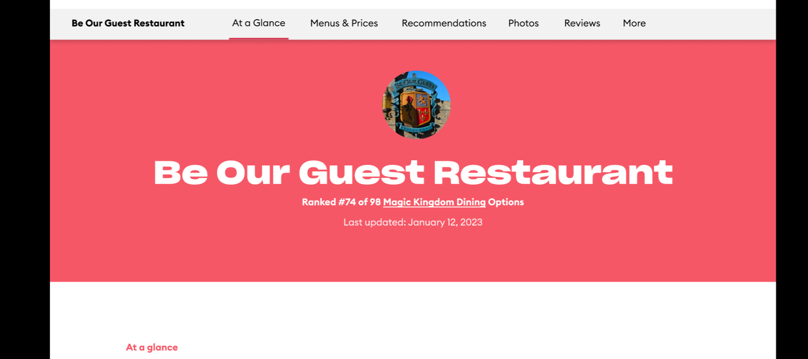
Spending an entire hero on a big blob of text that says “Meh”, while looking cool, makes it harder to comprehend, especially separated from the giant horde of information presented above. I recommend unifying it to increase cohesion.
I believe the front of this web page should be reserved for only the most stunning photos (dimmed as to not overpower the text, of course). I think letting some cheap, naer-do-well solid color take the stage is cruel and disheartening to all aspiring photographers ![]()
Overall, great work. I can’t wait to see what you all have to design next ![]()
Definitely agree with captioning food pics.
I’ve been thinking about this:

And how it relates to the Recommendation (e.g. “Meh”). I think the Recommendation needs to not simply use the overall rating, which as discussed above, causes confusion. “Meh”, for example, makes it sound like the food would be so-so. It doesn’t really imply, to me, that price is part of that.
It might be better to make the Recommendation based on, perhaps, two (or more) of those broken out rates. So, for example, “Quality” (which I ASSUME means food quality, although that isn’t clear) is higher, but Value (which implies cost) is lower. So, perhaps the Recommendation might say, “Good food, but expensive”. If, on the other hand, Quality was 2, and Value was 5, it might say, “Meh food, but totally worth the cost!” (Or something like that…I’m making up the verbiage to illustrate.)
Late to the game here but I have one comment I haven’t seen.
When I opened it, I was missing the “ant” of the word Restaurant on the banner, and when scrolling I was constantly having to move left and right to read it.
I use an iPad but most web pages automatically resize to fit the screen. Not sure if it’s the software or something else? Isn’t an issue with the Touring Plans page that I’ve just looked at.
It’s a Figma prototype, not the real thing, so it was probably just made for a specific screen-size.
I realise that, and you’re probably right.
It’s just that the other pages I’ve been involved with previewing haven’t had that problem, so I thought it was weird.
Weird. Prototype software is extremely clunky, so that might be why. Who knows, though.