Any chance you can somehow note the restaurants that are most challenging to book at 60 days (the ones most requested for the ADR finder?) it might help inexperienced planners.
Also, I think all MK restaurants now have “specialty cocktails” so the wording on that might have to change?
The overall look seems nice and clean. But I can tell much on the phone. Everything is far too small to read, and this mock up doesn’t allow me to zoom in.
Do you have a mock up of what it will look like on a phone? I am more inclined to view things on a phone…and if I can’t, I only then would move to a desktop.
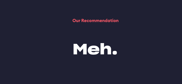
I really like the Our Recommendation part. In fact, that is so key, I frankly would pull that up to the top, maybe just below the description so it shows up without scrolling. Kind of a “we think it is meh, and now here are the reasons why”.
That can be super helpful when you are debating between various options, and you want some quick opinion on each option.
The banner takes up a ton of real estate while not conveying a lot of useful info. I also think that the prices could maybe be a useful part of the “At a glance”, at least moreso than the detailed user ratings.
I like it a bunch . I’m viewing on my phone - samsung Galaxy S10 if memory serves. Crappy 2 bars of 5G.
Everying’s legible. Plenty of useful info.
If I’m reaching I think of some kids being scared in one of the rooms. Also that the last time I was there it was noisy. Most Disney restaurants are. Tho the price and wine/champagne availability might give the impression that the kid/noise factor would be less of a thing.
I know it would be a major project but is there any way to identify either “what makes this restaurant special” or “why visitors might want to eat here”? I think BOG is a great example of this but Skipper Canteen and Tony’s might be restaurants first timers might need to know more about? BOG is special for my 30 something family members. In fact my niece said eating there was the “highlight of her year” five months after the dream wedding she planned her whole life. You walk into the movie. Many Disney restaurants tell their own story and I think it is important to put it up front.
We’re working on the mobile version now. Will post when it’s ready.
I really like the Our Recommendation part. In fact, that is so key, I frankly would pull that up to the top, maybe just below the description so it shows up without scrolling. Kind of a “we think it is meh, and now here are the reasons why”.
One thing I would like is a breadcrumb or a way to get back to a main page of restaurants. Or a drop-down of all restaurants or locations. If someone sends me a link to that page, I have no idea how to quickly get to other MK restaurants.
The figma prototype didn’t have a working menu, that I could tell, so it might be on there.
The fact that they did away with QS lunch and canned breakfast altogether might play into that… I know that’s why it’s no longer on my list. Seating people for a $67 lunch at 10:00am is ridiculous.
I like the information. Visually, there are quite a few background colors which can make it seem cluttered, and the red font can be a bit difficult to read (on multiple backgrounds, but especially on the purple-ish one).
I put the page through colorblind tests, and it is pretty good contrast for all colorblind types, but I agree that red should always be used sparingly. It hurts my eyes.
I like the new look. Agree about putting TP Rec closer to the top of the page (but keeping other options at the bottom). A vegan/vegetarian friendliness rating would be awesome in the at-a-glance section.