I am in thr same place as you. I ended up loving the current color. But I do think they can embellish the new color scheme in a way I will love it just as much in the end.
3 Likes
I would love it if they kept the vibrant blue. The previous blue looks washed out. The current blue just pops. I just never thought that the pink matched the rest.
2 Likes
other than the cake version, I have never noticed the color…
4 Likes
Pics from today are looking pretty stellar! It especially looks nice in morning / evening light.
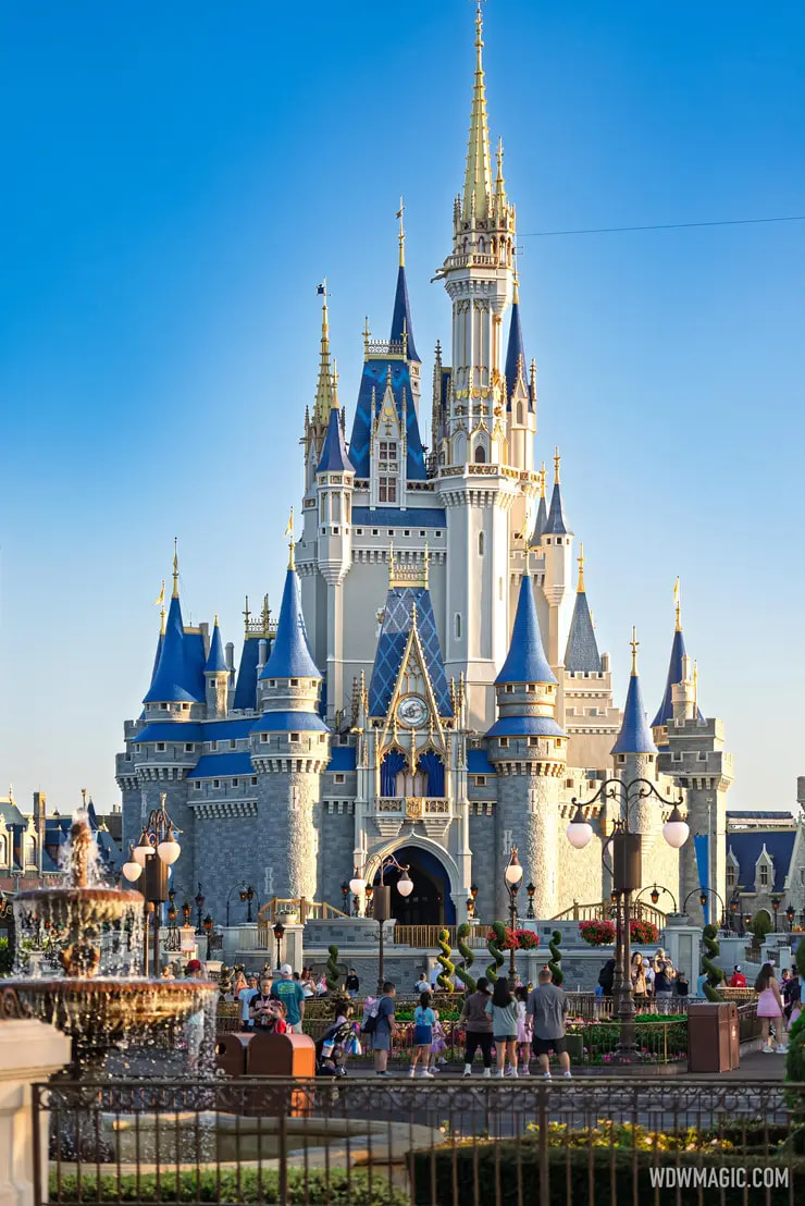
Here are a few posts from DFB today:
https://www.instagram.com/p/DVt_npMkSOU/?utm_source=ig_web_copy_link&igsh=MzRlODBiNWFlZA==
https://www.instagram.com/p/DVrix3rEayd/?utm_source=ig_web_copy_link&igsh=MzRlODBiNWFlZA==

5 Likes
Looks good!
1 Like
I guess I will look forward to whatever they paint it for the 60th…
1 Like
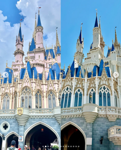
Great side-by-sides of the old and new.
https://www.instagram.com/p/DV1cTVaERXB/?img_index=14&igsh=MXM5enBwa200emJxNQ==
1 Like
A few screenshots for folks who don’t like to click. ![]()
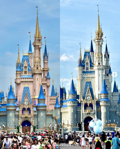
I can’t tell if I like it better. I think I do. But I’m not 100% sure. I like that they used multiple colors of gray / white so that it doesn’t wash out or look too bland. I wish the gray of the masonry on the lower part of the castle was a bit darker, I think. Or had more variation among bricks. I like the blue color of the toppers. The gold adornments are great too.
Overall though I wonder if it would be better with just a little bit more color in the face of the castle.
4 Likes
I definitely love it better. I’ve always thought the pink was out of place.
4 Likes
For fun I asked my family what color the castle was.
No one could tell me.
2 Likes
I think it looks more “magical” now
1 Like
I am completely the opposite. It looks positively commonplace now. The irridesent pink with the blue and gold was just fantastical. Loved it. Now it is fine, but nothing special.
1 Like
Yes as most things for us. lol. I think the gold pops out more with the white and it makes the spires look thinner and therefore more like something far away in the sky or some such. Aka more magical to me.
1 Like
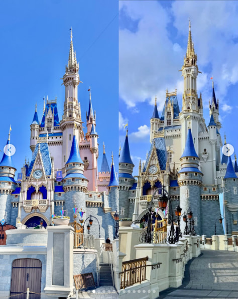
For contrast, here is the “old” castle from 2019. I think the blue looks much more washed out and sad. And the gray color is too muted, so it looks like a concrete bunker.
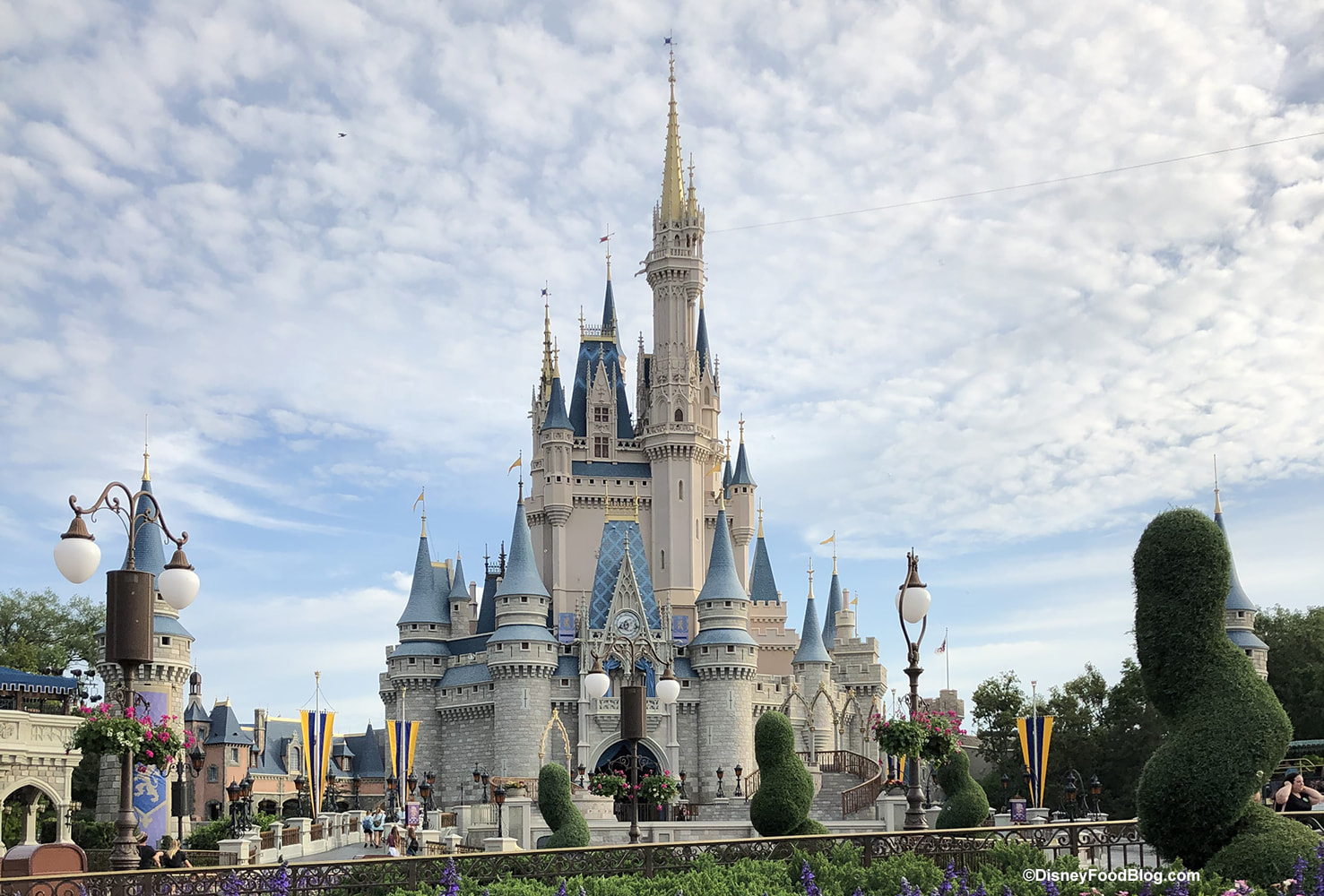
Here’s the new one again. I think it’s a good compromise between 2019 “classic” and 2021 “50th.”
5 Likes
Oh, the washed out blue was definitely time to be fixed!
I also think in all cases, photos never do it justice! I didn’t realize how beautiful that pink actually looks until I saw it in person!
1 Like
I much prefer the classic grey palette. The pink gave Barbie Dreamhouse vibes.
1 Like
I may be in the minority here, but I liked the pink. It reminds me of Stirling castle, which was that color to make it stand out and show off.
1 Like
Side by side, I like the pink. If I’m standing there looking at it, I’ll like the gray ![]()
1 Like
When we were there in February, most of the pink was already gone, and from one angle, you pretty much couldn’t see any pink. In person…it is boring. ![]() “Bring back the pink! Bring back the pink!” (Do you think I should start picketing?)
“Bring back the pink! Bring back the pink!” (Do you think I should start picketing?)
Now, in a couple years, when they decide to redo the entire castle in bright yellow and orange ![]() , I’m sure I’m complain about how much I love the gray. I’m fickle. Okay?
, I’m sure I’m complain about how much I love the gray. I’m fickle. Okay?
3 Likes
Ok! ![]() I just love the castle, and I can’t wait to see it again.
I just love the castle, and I can’t wait to see it again.
But…no yellow or orange please! ![]()
2 Likes