“Other fun activities in Walt Disney World, from shopping at Disney Springs to mini-golf and water parks”
So you’re not mentioning Galaxy’s Edge on the cover at all?
Info on how to get a BG could still be a big selling point.
2 Likes
Good point. I’ll update the back cover’s six.
1 Like
I’m quite neutral on this.
I think it shouldn’t be a cover item because the target audience wants to know about the main attractions. Mini golf etc is something you would learn about after a bit of research on the parks, like an added bonus, so it’s great that the book covers this, but I don’t think it’s a selling point.
Contrarily…
I think it should be a cover item because it’s highlighting the fact that the book doesn’t just cover the basics of the parks and that it goes in depth.
Updated back text bullet points to include SW ROTR.
3 Likes
Would it make sense to flip bullets four and five? Exclusive touring plans before hotel rooms? Planning seems to tie to bullet 3 and hotels to bullet six?
1 Like
All bullet points look great, glad to see the liner community coming together and assisting! 
2 Likes
Just chiming in to say I also vote C.
1 Like
I vote C for the pic (although is that the “old” castle?
and also I want a kids version for my daughter of this book!!
Another vote for C, though all of the photos are stunning.
I had this thought, too. Then I convinced myself it was the new color scheme, just heavily filtered. But I’m not 100% sure - it’s really trippy how blue those roof tiles are. But the bricks on the walls are multi-colored, which makes me lean toward the new one. And also it’s pretty clearly a peachy tone, if not the poppy pink that you see in some photos.
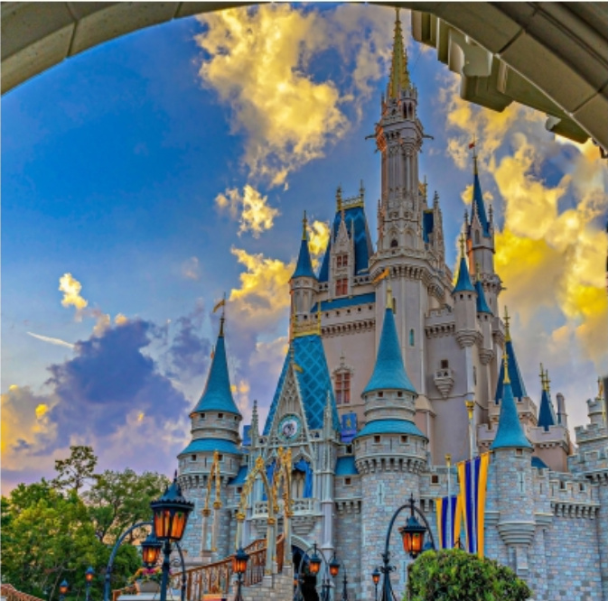
Here are the old and new castles in neutral lighting for comparison:


Edit: I found this close-up of the old one and the coloring on the bricks is definitely like C:

Good eye. Also notice there are no curtains just below the clock in the new one. But C definitely has the curtains.
As much as I think C is beautiful, it really would be best to have the new castle. But the fact we all didn’t notice at first perhaps makes it okay.
1 Like
I agree it should be the new castle . I thought it was just the lighting
1 Like
If C conveys hope and warmth, I will probably be okay with it not being the current color scheme.
8 Likes
I pick C, b/c it puts the new coloring in the best light 
1 Like
I think it looks terrific as is. Hope and warmth are key. (Also, I’m color-blind so I didn’t notice the difference…)
C . Looks great!
I’m good with C. If it takes that much sleuthing to figure out if it’s the old vs new color scheme I’m sure no one will notice or care.  And it’s beautiful!
Golden badge is key place to say something like
*Disney’s success responding to the COVID-19 challenge”
Then one of the bullets could explain a bit more on how the protocols put health and safety front and center.
(Sorry-have just scrolled down without looking at all the responses so as not to influence my first thoughts on the cover…I’m probably not saying anything new!). Good luck!