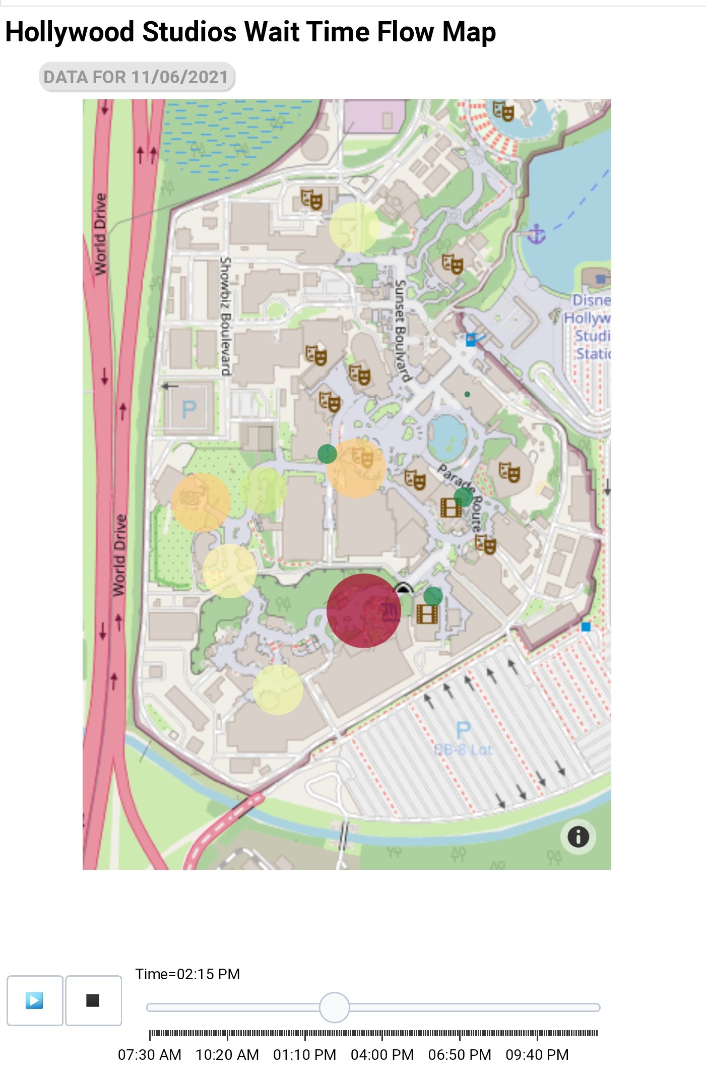
Many years ago I remember there was a “heat” map that showed for each attraction the average waits for each hour of the day. This was particularly useful for tweaking a plan without having to use evaluate a thousand times.
Like what @Sunshiney_Disney_Momma shared, just look at the graphs for the individual rides. You can just start from the crowd calendar, pick your date(s), and then “view park wait times” under the individual park.
Maybe OP was conflating the park heat map with the attraction wait time graph. I certainly didn’t remember that the heat map was only for the park as a whole until I looked it up.
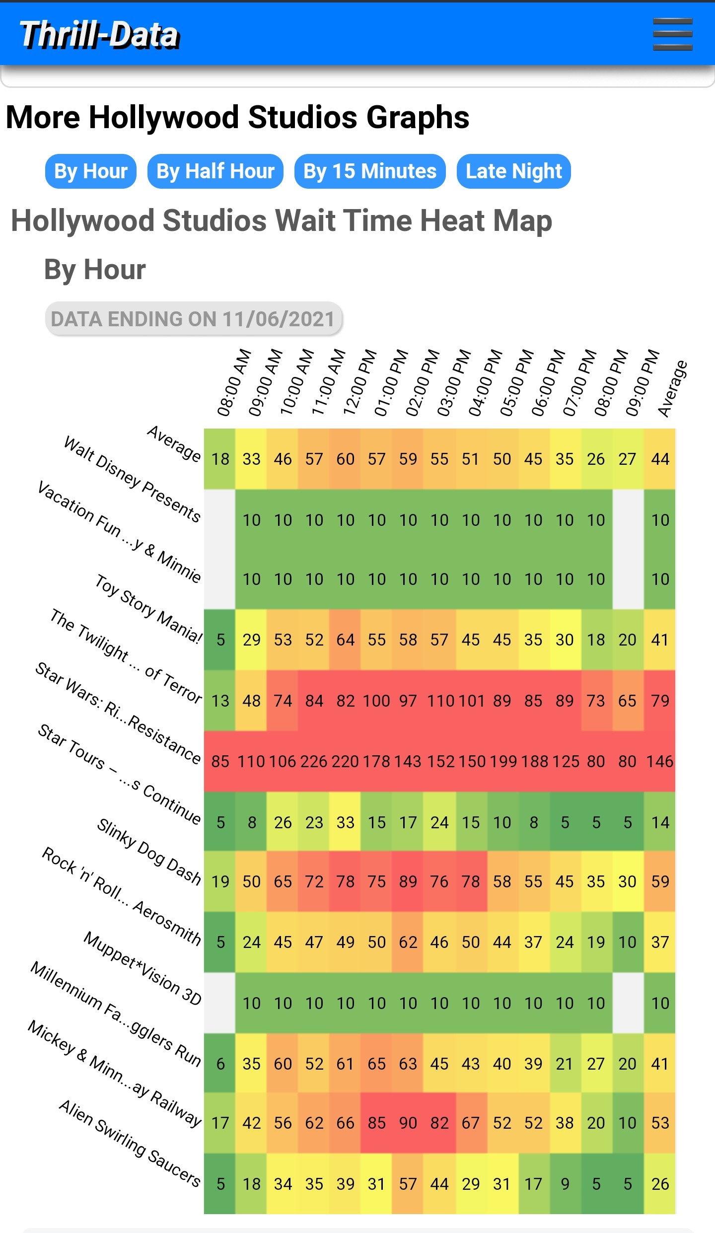
@SneakyPete checking back in here. Thrill data has great heat maps. What I like to do is look back to a similar day of the week or weekend and get that data which should be close to the day I visit.
Here is an example. This is HS from yesterday. The heat map gives good detail on what to expect.
As far as heat maps predicting the days ahead, they are not always accurate. It seems that looking at real data from a recent/similar crowd level day is the better way to go anyway.