Opinions Wanted: New TouringPlans Hotel Page

Yes! Along with a list of the different transportation options for each resort.

I like the tabbed look, it looks very easy to navigate. I second @ryan1 having easy navigation to the room finder would be a great new feature.

I like a lot of room pictures so a slide show of many pictures of the whole room, grounds and pools would be great, I am always surprised by how hard it is to get a good look at the pools, I always end up doing an extensive google image search to get an idea of what the actual pool area looks like.

4 Likes

I love the tabs to easily get bite sized information related to each resort that is specific to my search. I also agree with a world map showing where exactly things are. I usually use google earth. One suggestion I have is that often I’m comparing things among hotels to make a decision where to stay. An example is whether a resorts pool has a slide, tub vs stand up shower, etc. I think it would be helpful to have a generic list of items with a green check or red x if that resort does or does not have it. It makes it so much easier to scroll down without actually reading and see what is or is not there.

5 Likes

I like this idea a lot.

1 Like

It would be great to have this on a tab for each hotel, but also a chart that includes all hotels (or if that’s too cumbersome, to compare selected hotels).

1 Like

The tabs will be much easier to use

It’s a huge improvement! I think you need a tab or button for a photo gallery. A gallery view can have a different number of photos for each resort without creating design headaches, and can easily be added to without overhauling the page.

I agree with the above suggestion that a map would be super helpful. Both a map of the resort (where are the Pirate rooms in relation to the bus stop? Are the family suites near the good pool or the boring one?) and a map of the whole area showing proximity to parks, other resorts, transportation, etc.

3 Likes

I really like the tabs, seems very user friendly. As long as it looks good both on a computer and phone.

I like it too Brian! Tabs are great, but sometimes I don’t see them right away and can’t figure out where the rest of the information is at. However, the fact that you have the current tab a different color than the others made it “pop” so I saw how it was organized immediately. Looks great!

1 Like

Yes! Adding my “approval” for the cleaner, tabbed approach. I have many times ended up pulling out the book to more quickly find some of the info. I think the tabs are fairly intuitive – especially because WDW’s site for each resort has tabs like that.
Also liked one of the previous suggestions for having a slideshow in the “title” area, although that is a pretty picture … it is a lot of real estate for just 1 static picture.

Since you were asking about “any other” pages, I would like to point out a few things that I find bothering on the website.

First, you offer a myriad of tools, such as the Reservation Finder, the Room Finder, FP availability, etc. But I always struggle with actually getting to those tools. It would be ideal if there as a top-level menu on EVERY page of TP that provides quick/easy access to these tools. But right now, they aren’t there consistently. Which brings me to…

Second, the menu options at the top of the pages changes depend on context. For example, here is my dashboard.

And here is the Universal Studios page:

Similar, but different. But then you drop down into some of the sub-pages, such as the crowd calendar:

Completely different look! (Actually, the last look, over all, to me is much more appealing, although it wouldn’t be complete for the top level.

Third, I also find myself getting lost in the site because once you have gone down the path for one park, you can’t cross over. For example, for the Crowd Calendar…I’d like to easily switch between (or perhaps even seen mixed) Universal with Disney, since I may be planning a vacation that involves both. But in order to go from the Disney Crowd calendar, I have to click back to the home where I can then select Universal. It would be better if I could just switch directly from Disney to Universal and back for the same dates.

And speaking of the Crowd Calendar, I find the tabs there confusing, and I end up having to click each one because I can’t differentiate based on the names what each will end up showing me.

image

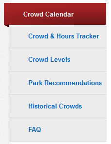
For example, how is “Crowd Levels” different from “Crowd Calendar” or “Crowd & Hours Tracker”? I don’t really know based on name alone. They seem like they would be the same thing…and, in fact, “Crowd Calendar” and “Crowd & Hours Tracker” are very similar (possibly redundant?). But when I click on Crowd Levels, it takes me to a text-heavy page that no longer has the tabs on the sides, and is back to the same header style as the main pages.

And then the “Historical Crowds” seems odd…why can’t I just jump there from the normal Crowd Calendar page? I sort of can…but if click the link, it, too, takes me to a text-heavy page not in the same style…which in turn gives me a table of date options that simply jumps back to the Crowd Calendar-style pages. And again, it would be nice to just be able to easily jump between the Universal and Disney data directly.

5 Likes

I like the format overall, as well as the tab section in the middle specifically.

I agree with all this. The overall navigation could use some work.

I consistently exit the site and google to find things (Dining Reservation finder and Room finder are biggest culprits).

There are also interesting things posted in the blog that are never put in the “main” website. Certain heat maps and other interesting data analysis are done as a one-time thing, so I take screenshots and paste them in my planning spreadsheet. Same day FP availability is a great example: https://touringplans.com/blog/2019/07/02/fastpass-availability-at-walt-disney-world-update-4/

2 Likes

This! Glad I’m not the only one struggling with navigating!

Agreed tabs are good.
I would change the last into “more information/links” (could be standard for all resorts) Links include 1) map to where that resort is in the WDWverse . 1.1) Maybe miles by driving to each of the 4 parks as part of that 2) Blogs or videos that you have done on this resort and it’s rooms (those videos are the best!!). 3) Background to the resort (maybe Disney dish- or to other websites that have that whole background story most don’t know https://www.portorleans.org/backstory.php). - also The intro could put the boat transport to disney springs and sister resort with its sit down restaurant together with the comment that it doesn’t have a sit down restraurant because in someways this resort is best for sit down options considering that.— In general I’m found of a branched structure as it is quicker than lists- so links under each tab would make it easiest. To get more detailed info on each topic. i.e room pictures and room videos could be a further link in the rooms tab. For some resorts where there is more variety you could have this substructure by room (so in PORS there is the version with the pull down bed). I think you have a lot of this info, but it isn’t always easy to get to.