
I cannot even waaaaaaaaaaaaaiiiiiiiiiiiiiiiiiiitttttttttttttttttttt!!!
It has been so fun brainstorming. It will be awesome to see what the end result is!
When? Should we set our alarms? Will it cause Disney IT to crash (that’d be kind of some good karmic fun, wouldn’t it?)
so the store isn’t fully showing everything yet, buuuuut i think we can give you guys an early look. (click on the images to be taken to the product pages)
Park “Stencil” Shirts.
AK - Maisha ni Mazuri (Light Theme)
MK - The Story Comes Alive (Light Theme) 
EP - Shape the Future (Light Theme) 
HS - Mysteries and Magic (Light Theme) 
Achievements Unlocked
Plan Complete V1 (Dark Theme) 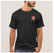
Watch Me Not Wait V1 (Dark theme) 
Watch Me Not Wait V2 (Dark Theme) 
Misc
Touring Plan Comes together (Light Theme) 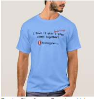
To Do List (Light Theme) 
To Do List (Dark Theme) 
I love waiting in lines! V1 (Dark Theme) 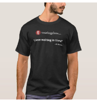
Touring Plans T-Logo button 
Some Important notes.
THE DESIGNS ARE TRANSFERRABLE.
-
While they’re all on 1 t-shirt style, the color and type of T-shirt is completely up to you. So play with your options. You can even go in and adjust the design’s placement should you choose. We’ve left it completely customizable for you.
-
They’re even transferrable to different products. You aren’t restricted to just having them on a T-shirt. At the bottom of the page, you’ll see the option to “transfer this design”, go ahead and do so, have some fun with it!
example:
MORE DESIGNS ARE COMING
-
Obviously we didn’t get them all from the suggestions/feedback threads, so more are definitely coming.
-
You’ll notice there’s Dark Themes and Light Themes currently. Soon there will be both themes for each shirt. This round was mainly getting us familiar with the process of adding products (it’s actually somewhat complicated, and zazzle is slow, if you don’t have direct access to the store’s account. So please be patient).
-
You’ll also notice a few have “V1” on there. More versions are coming (Designs on the front, designs on the back, etc). so everyone will eventually have the option they want. If you don’t feel like waiting, you can adjust the design now in the interface.
HUGE THANKS
- To @PrincipalTinker, @missoverexcited, and @len for setting this up and allowing us to do this. Both @PrincipalTinker and @missoverexcited spent most of the day figuring out Zazzle yesterday so we could get this done. So… be sure to thank them.

Ok, I think that’s it for now. As we get more and more familiar with this process, things will be refined and fixed, so please pardon us while we stumble through this!
oh yeah, and treat yo’ self cause there’s a 25% off sale going on using the code BIRTHDAYSALE
(lasts until Sunday, I think)
Ordered
= )
I am so impressed! 
Thanks to all three of you for all of the hard work it took to bring this together! Gonna do a little shopping 
Yes. Thank you @PrincipalTinker and @missoverexcited and @Randall1028 and @len and all the other Liners who contributed to the designs… for placing a good dent in my bank account just now.

Can you tell me what is a “white underbase” and why might we want it or not want it? I have looked at each design both ways and I can’t perceive a difference. Is it possible that these designs are unaffected by this factor?
It’s for when there’s white in the image. The white is ignored if “no white underbase is chosen”
Classic vs. Vivid Printing
Classic Printing: No Underbase
4 Color
No white base layer is printed on the fabric, any white used in the design will come across as transparent allowing the color of the fabric to show through.
Vivid Printing: White Underbase
5 Color
Fabric is treated with a white base layer under the design, allowing the design to be more vibrant. Extra production step may require a surcharge.
whoa @Randall1028! that was such a quick turnaround to get everything designed, completed, and posted for ordering. kudos—to you and everyone who helped—for your efforts to make this happen.
I’m impressed! That’s been a lot of work to set it up this quickly. Thanks all
This is so great! Thank you everyone!
Just noticed something.
On the HS Mickey one (Fantasmic Plasma Ball) it says “life is good” on the lower left (as it is worn, lower right as you look at it here) of the image. I am wondering if this was leftover from the AK tree of life one, where it is the translation of the Swahili. I don’t see it on the other designs which makes me think it was a mistake that it is in there?

Thought I should bring that forward before people order
Amazing work! Great job.
Sonuva. Yeah, it’s a mistake. Thanks for pointing it out. I updated the design, but I’m not seeing a reflection of the update yet on the link. It MIGHT require it to be republished, which will then need to be a whole new URL.
I’m disabling the URL for now. I’ll put it back up if the design updates. 
Well, the url is misspelled too  i think it says “in mazuir” instead of “ni mazuri”. So if you’re going to republish, maybe you’d want to update that while you’re at it
So long as it’s not misspelled on the shirt, I don’t care that much 
I did check that too And since it’s a clickable it doesn’t matter that much. Didn’t know how much it would matter to you.
I’ve just realized I’ve jumped between the two shirts without being clear on that. I think you’re following my caffeine-starved brain’s thoughts though.