Is it possible to add the age group option to the left margin and when you select one, the page will auto scroll down to the desired age group? Something like this:
Not a fan of the color. But the overall look is clean.
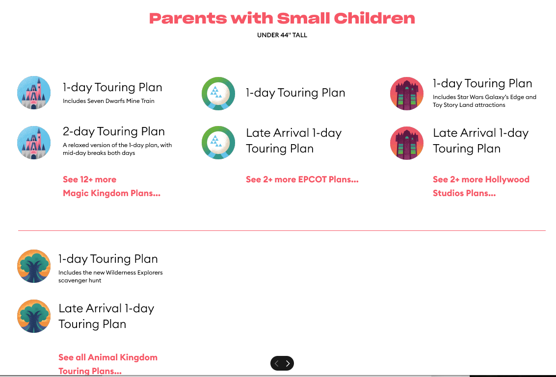
I almost think, at least on the mobile version, that the categories of touring plans are too big…forcing extraneous scrolling. I would rather see the options all at once, if possible.
I don’t hate the colors, but I do associate the red/burgundy with Touring Plans. I like the new logomark. I like the layout except for maybe the “hamburger” menu at the top. I think on desktop it might be better to have top-level navigation up there like you do now.
Having the “connect to a travel agent” link in the same box as the “create customized touring plan” makes it seem like an agent is the only option for a customized plan and that the whole flat box flows to that agent link. Points for trying to drive revenue to that sector of the business but I would separate, maybe with a prompt “Want us to do the planning work for you? Contact one of our travel agents!——>”
A couple of other tweaking suggestions for the Desktop version:
Under “Quick Tips”, consider “We also have” instead of “We’ve also got”; also, in that same section, last sentence, I’d remove “the” before Magic Kingdom.
I like your icons for the various parks, but newcomers may not understand them, so I would also include the park name in some way. You could consider labeling the top of each column, or just include the name in the plan (ex: “1-day EPCOT Touring Plan”)
For the sake of consistency, standardize your additional plan links. Some say “see 12+ more” and some say “see all”.
Also, I would standardize section breaks. In all sections except the “seniors” section, you have a line break before AK plans.
Are there no Mixed Generation/Whole Family plans for HS?
I agree with most of the other comments above, however I think the colors are fine, and I don’t mind the scrolling. Scrolling is obnoxious when there is a ton of content and small print, but large, clear graphic text boxes like you have are fine (and probably far more visually appealing to the younger generations, as opposed to the cluttering side menus we older folks find comforting.) Overall, I like the appearance and function of your new design.
@len , I haven’t had a chance to look at these pages yet. But I did see a great suggestion over on the DIS just now suggesting Becky does some tutorials on creating and using touring plans.
I think that would be a fantastic resource if they were half as good as her G+ tutorials for each park. I watched those before our trip and felt pretty confident when it came to using it for the first time.
Doing a couple of step by step walk-throughs of creating a plan, evaluating and optimising. And then a follow up of using it on the day and submitting wait times would be a great introduction to TP.
So often I read a comment along the lines of “I know Touring Plans have these plans but I don’t want to be stuck following a rigid plan in the park”. They have no real idea for how the plans work and how they can be used in real time. Watching Becky create and use them would help people understand. I’d suggest even doing one with just the evaluate option, to show how you can retain control over your park experience but still get real-time predictions of wait times etc.
She could then do more using the optimiser, and finally using LL times etc as a follow-up.
Not a fan of the new design. Agree with the comments regarding the colors. You have taken a very easy to use easy to understand graphical presentation and made it much less user-friendly.
I tried to play around with the new design, but the software just doesn’t seem to work on my iPad at all. I tried both the desktop and mobile sites.
I can only scroll so far down, and nothing actually happens when I try clicking on it. I’ve had that problem before and I realise it’s a software thing, seems it’s just not iPad compatible. And I’m not good with using my phone for stuff like this.
However my comment is that personally I think the first choice should be for the park, not the type of party. Something like the MDE app where the four parks are shown, either across the page for desktop or listed for mobile. The reason is that if someone is unfamiliar with the plans they are likely to want to check them out for their favourite park.
Also regarding the type of party I would start with the adults or mixed groups rather than the groups with small children. I think starting with the groups with small children is more likely to put people from different categories off than vice versa. And ultimately you need to appeal to adults, whoever they’re travelling with.
Also I would have a question like “who’s in your party” and have each category but also a “show me all plans” option too.
However my suggestion is that the personalised plan option should also be prominent on the front page.
And am I the only person who really, really doesn’t like the colour?
Works better on my phone. I could actually see everything for a start, and the personalised plans is prominent.
I assume it’s meant to only open up the one category at the moment, whatever I clicked I got the touring plans for the families with small children.
I would still prefer to see the first choice be by park, but the mobile version on my phone is infinitely better than first impressions using my iPad.
I’ve thought a bit about the categories again. I guess I’ve never like d them because they seem too exclusive instead of inclusive. My gut reaction says “why a separate category for seniors, do they think we’re too old to ride thrill rides or something?” So perhaps an explanation up top - “we use the ratings provided by different age groups to identify rides that appeal most to them” would avoid offending potential users.
@len I’m liking the new design of the website. One question: is it possible to navigate directly to the historical crowd calendar anymore? Would it be possible to add a link to the main Crowd Calendar page (or make it possible to scroll back to the past in the regular CC)?