Keeping on with the website glow-up, we’re starting the redesign of the Hotel Room Finder tool.
The current landing page for the tool is here. It can be improved.
Goals
I think the goals for this redesign include:
Explain what the tool does As far as I know, “The view from every hotel room” is completely unknown in the real world - nobody else offers it. So we have to explain to people what the tool does. That includes the ability to email Disney with your room request.
Explain why it’s important I think we have a good start on this (Disney charges a premium for its rooms, some of them look out at green electrical boxes, etc.)
Explain how to use the tool How to use the filters for distance, noise, etc. This might be brief, if we think people get the idea of “Use the filters on the left”.
Make it easy for the user to select a room. We’ll send this request to Disney later. Besides “Here’s a huge collection of room views”, this is the other value proposition for the tool.
The mock-ups are fairly detailed. Click anywhere on the page and you’ll get walked through most of the process, up to the point where you see a specific room and can select it.
This is one of the more involved tools on the site, so I expect this will take a while to get right. I appreciate any comments or suggestions you have. Thanks!
I like how the process has been fully mapped out into the steps.
On step #2, you may wish to explain that they should click on a highlighted building to view the room layout.
You may wish to tell them the step that they are on and repeat the instruction for that step in the ensuing pages. It’s a lot of information to remember between pages.
Those two colors you are using for backgrounds clash and the more I see the combination the more it repulses me.
There is not enough contrast on the section with the orangey background.
I question the question marks on the checkboxes.
I love the layout and the easy to read table format.
ETA: I didn’t have a preference between option A & B.
I think option A best aligns with your goals. For those of us who have used the tool before, we don’t need an explanation, but if you are trying to present your unique value proposition to new users, option A does that most efficiently. And again, taking the viewpoint of a new user (and perhaps someone who is planning their first Disney vacation), the brief descriptions of the different resort types you showcase in option B are a great feature. Assuming you will have an entire section with details about each individual resort, it would be good to provide a link to that here as well.
I like option B too b/c I can see more resort names right away rather than having to scroll through a list. I’m sure this is just a preference as I always choose grid view over list when I have the option.
For Option A I like that you are leading with “What difference does a room make” because that brings the whole point home immediately.
But, feel like those informational boxes on the pages takes up so much vertical real estate much much scrolling is needed to get past those to find the tool.
Related to that, I think I like the resort options selector from Option B because once you select a resort level most, if not all of the resorts will be right there for a single click and I won’t have to scroll any more.
I agree with this and I also think the sales pitch - particularly the “make the premium worth it” part - in that form is a bit risky. We all know that requesting a specific room can be difficult and isn’t necessarily succesful, and I think that description might give the idea that it’s as simple as picking what you want.
Also, the focus on the descriptions seems to be very much on views. it might be worth mentioning room location, distance, connecting availability etc which at least to me are equally important. It’s a great tool and I’ve used it extensively every time I consider any WDW resort.
That said, I think the second layout looks nice and seems functional.
Will the actual room photo and info open in a sort of pop up? I couldn’t find a way to get back to the map view apart from clicking the browser back button.
I like the top-menu selector on Option B - it’s smaller and (for me) easier to see which category is selected. The “down arrow” bar is helpful.
But, I like that you can see all of the hotels without scrolling in Option A. So…
The one request I have (which you haven’t asked for!) is to please keep North, North on the maps! I get all turned around when I use the room finder maps and then switch to google maps to get a feel for what it looks like “on the ground”
Oh - and I didn’t realize you could click through to one of the hotels. I like Option B better for the specific hotel page. Bigger map is better, for me.
I stayed at Pop last month and as it turned out, the view was almost completely irrelevant, as I wasn’t in the room much, and when I was, I mostly kept the curtains drawn (because the one small window faces the exterior public “hallway”).
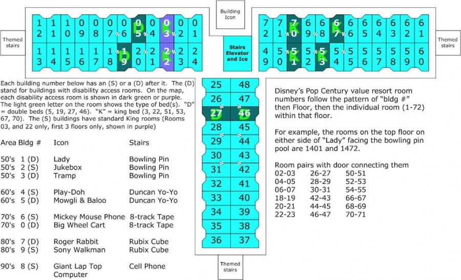
More important to me is the exact location of the room in the building. I like the diagram showing the building layout, which, if it exists in the currently published tool, I’ve failed to discover.
But I’d like to see a few more context clues on this diagram, besides the North arrow—an adjacent landmark or two, so I can orient it more easily on a larger resort map.
And I’d love to see each room number pinpointed on the same diagram, like this one
from Disboards (but not ugly like this one!):
I love the the favorites feature and the ability to make public comments and private notes on individual rooms. Are these new?
Is there a place for public/private notes on each resort as a whole? or is that outside the scope and purpose of the tool? I could see people wanting to recommend or criticize whole buildings, for example.
For me, the NUMBER ONE issue I’ve faced with the Touring Plans website is that I’ve always struggled to find what I’m looking for. Once I find it, I rarely need any kind of explanation as to what purpose it serves. Most people are computer-savvy enough these days to figure it out.
For example, just the other day, I spent a great deal of time trying to locate the historical crowd level data. I never did find it. I could only find the crowd calendar that makes future predictions.
So to me, in this case (the hotel room finder), I honestly don’t think you need very much explanation (at least not up front) at all. As long as we can navigate to the tool easily to begin with. I assume you have a tools overview page or something like that where you can get information about the tools available and click through…but also if you have a way to navigate directly to the tool, and bypass the extraneous information, even better. The extraneous information is only ever useful ONCE. After that, I just need to get to the room finder as quickly as possible.
I think you really only have one goal: Make it easy for users to find and request their ideal room. Your goal 4 is part of that, whereas goals 1-3 are just possible ways to help accomplish the real goal.
The less explaining you have to do, the better. People generally skip over explanations anyway. The two photos comparing different views one floor apart are great because they get the point across faster and more effectively than any verbal explanation you can come up with.
The step-by-step instructions for using the room finder are less helpful because, again, most people won’t even read them, but also because they aren’t on the page where a user might actually need them (the room finder tool itself). But you probably don’t need the instructions there, either. If users are having difficulty using the room finder (and there are some things that could be improved, in my experience with it), that’s probably a sign that the tool’s UI needs some plussing. The landing page should just show users why they should use the tool and make it as easy as possible for them to start doing so.
I really like the updated designs for the room finder tool itself!
In my experience, most people are not. You are looking at things through the eyes of a software programmer, who has a completely different way of problem solving than a regular user does.
I like to give users the ability to turn off instructions rather that the ability to find instructions for a step because I’ve conducted enough usability studies to know that users don’t always understand the intent or how to use a tool.
This is a good point. I haven’t seen an overview of how to get places. A place for tools would be great.
Me too! Even when I know what I want, sometimes it takes me 5 minutes to find it.
The one that’s hardest for me to find is the park-wide wait time predictions for a certain day (you know, the one the scrolls through a handful of wait charts - for each ride).
And finding a past day is a different process than a future day.
I disagree with you here. While I am a software engineer, I actually find most things I use unintuitive. I can explain to you how something may be implemented, but the User experience to me is confusing more often than not. I look through the eyes of an end user. I have a son with a degree in User Experience and we talk about this kind of thing a lot.
What has always amazed me is how proficient folks are about picking up how to use something if that something is designed with a semi-decent decent UX.
All that to say the room finder tool itself is pretty easy to understand (although sometimes clunky…so room for improvement) once you get there. So a vast majority of people using it regularly will not need all the up front explanation more than once.
I can’t tell you how irritating I find it when I use an app or website that insists on “instructing” me about some feature…interfering with me just using the tool!
I guess one thing I wish we could have is in the filtering of rooms - a connecting or not connecting filter. Nothing worse than finding the ideal view only to learn it’s connecting when you don’t want connecting. It would be nice to filter that from the beginning.