I keep coming back to this thread because I love charts and graphs and want to be helpful. But, I can’t envision anything that is quick and easy to look at.
This makes is sound like it doesn’t need to have mass appeal…because it is for the non-believers. Those people are going to take a bit longer to look at it digest the data. Or they’re going to shake their fists at you and accuse you of bamboozlement with complex stats.
Anecdotally, I met with an AI company yesterday that has a tool to help with heatmapping and line management…and while I’ve firmly always been in the ‘data analytics, if I can’t spreadsheet and chart it - I don’t trust it’ camp…yesterday the robots convinced me a little bit.
I’m going to keep thinking about this today…sorry to my actual job.
You are AWESOME, @len. We love you and appreciate everything you do!
I mean, we might not like HOW you do it, or even the outcomes of your efforts…but it isn’t about that. It is about the fact that you TRY. And without TRYING, no man would ever be a success! (Well, I mean, I suppose on occasion someone lucks into success, but I’m not suggesting you’re lucky.) So kudos to you.
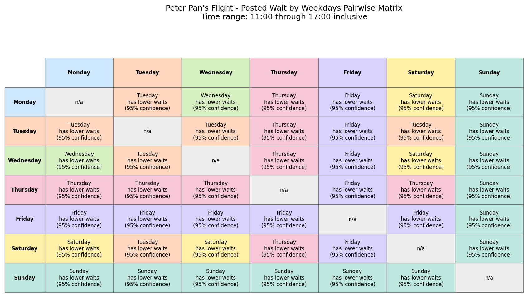
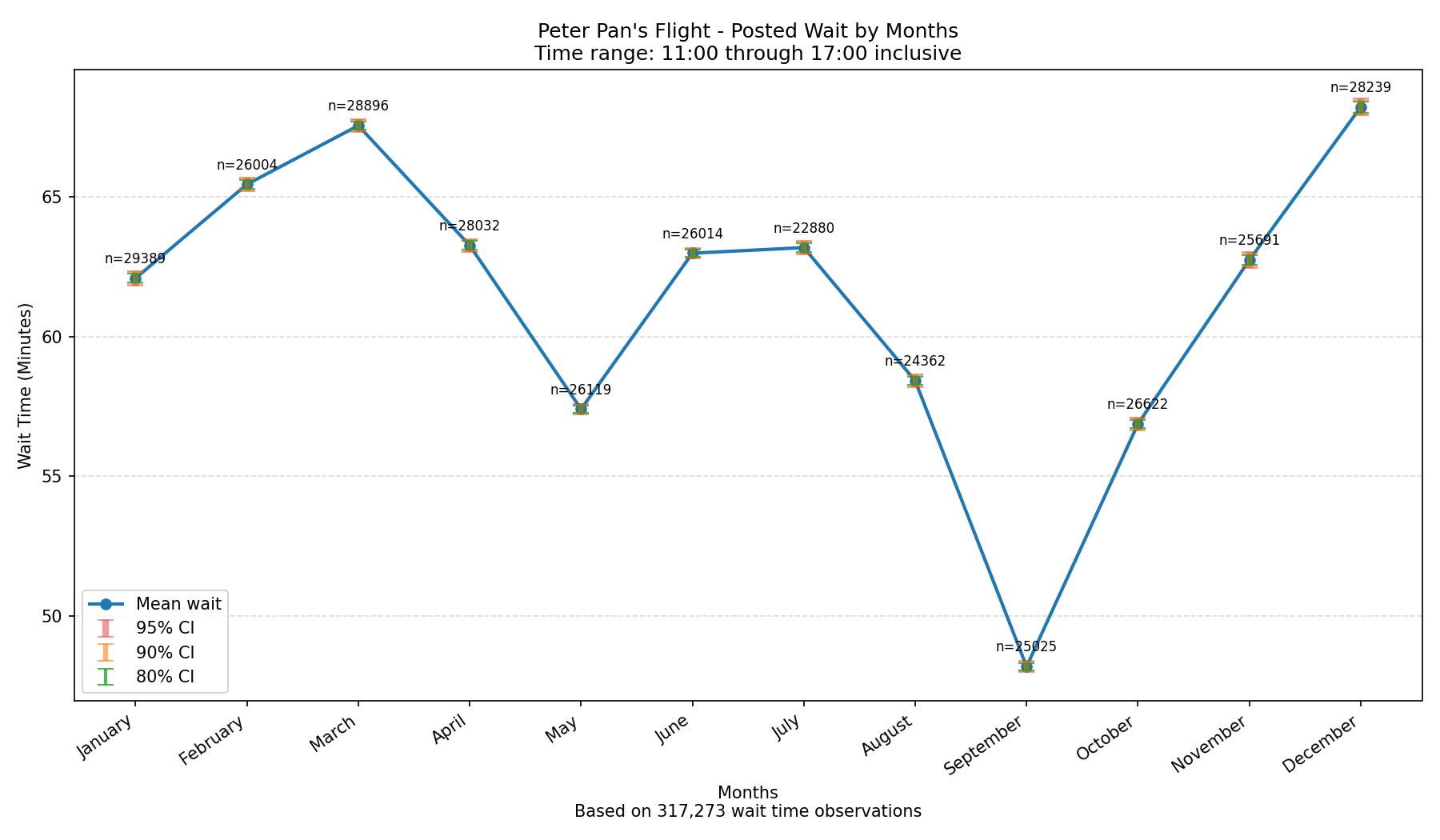
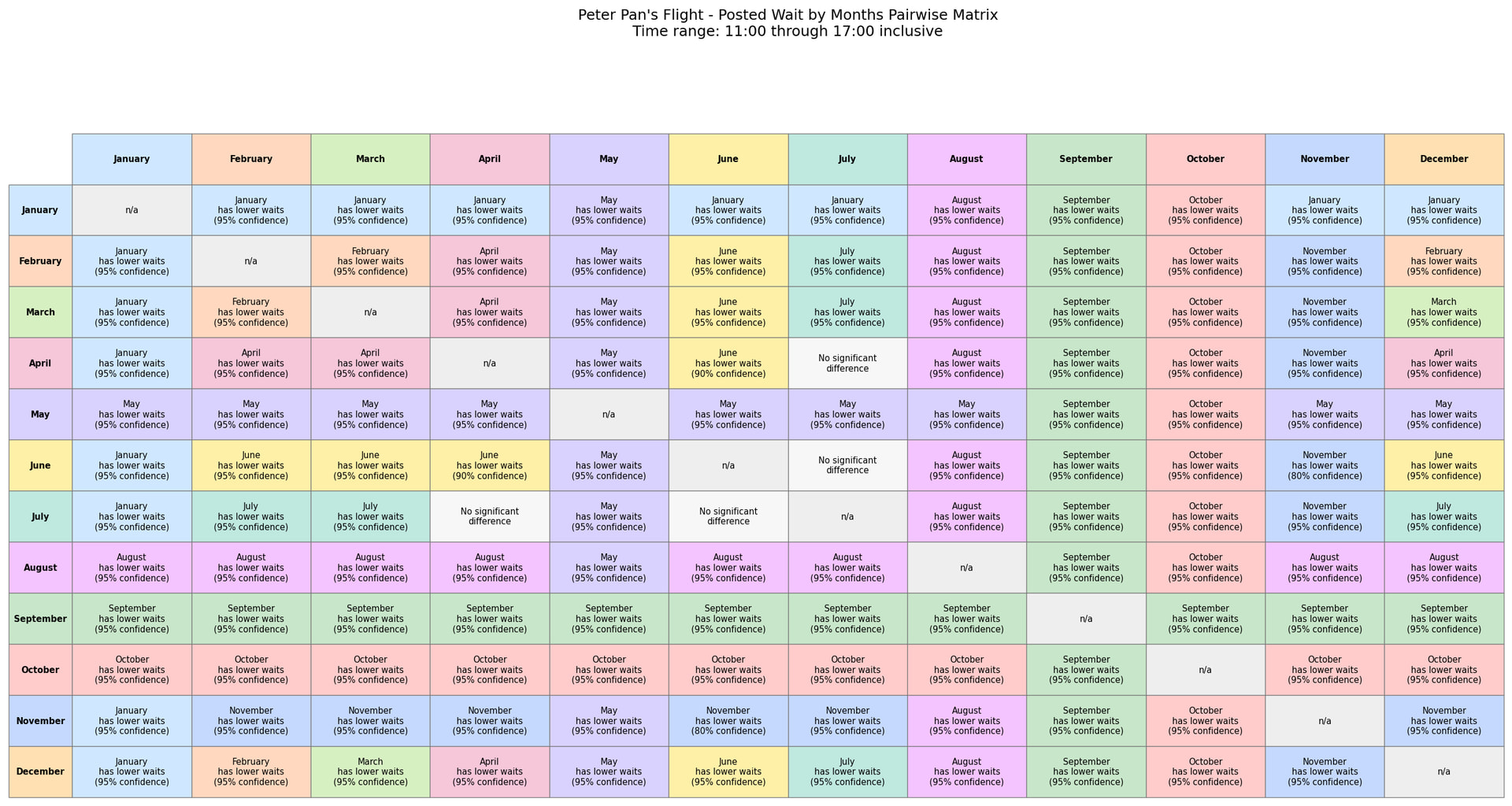
Related: I’m trying to answer questions like “What’s the best day of week/month to visit X for low crowds”, like “What’s the best day of week to visit Peter Pan’s Flight” or “What’s the best month to visit Magic Kingdom.”
Does the graphs below explain the weekday/month thing for Peter Pan?
In some ways, no. The way the Weekday graph looks, it makes Sunday the very very best day to go to PPF, and Monday the very very worst day. There is a case to be made where a crazy number of vacations start on Monday and end on Sunday. But the actual difference here is not even 7 1/2 minutes.
Thursday and Friday, those differences look like mere seconds.
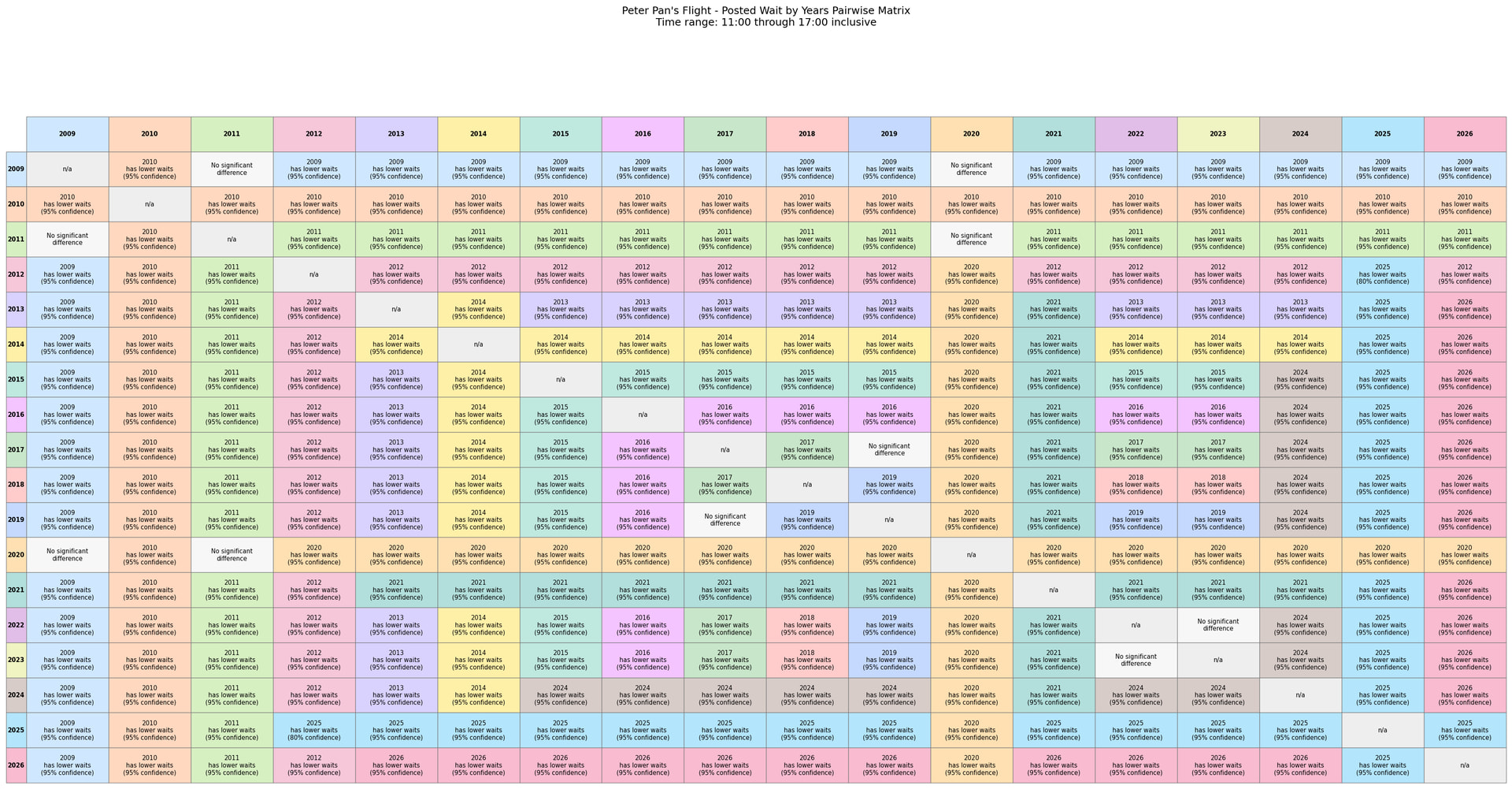
I may also be more inclined to remove 2020 and 2021 data from the calculations, just because the world was so much different during that time.