I like this one. It makes sense to me right off the bat.
1 Like
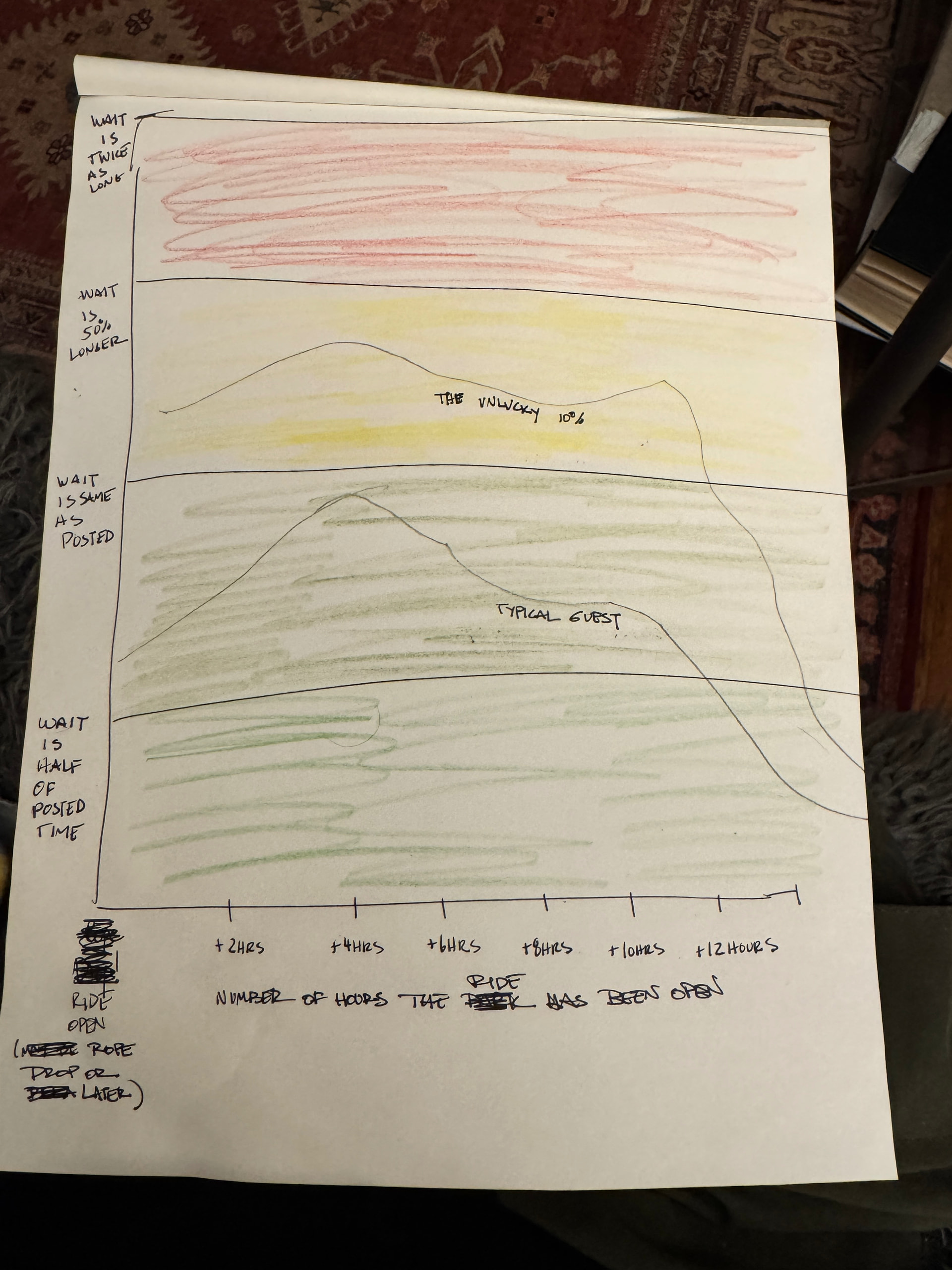
Of your ideas, I like this one best. I’m still not sold on the horizontal axis being how long the ride as been opened versus a specific time, because I have to do mental math. If it is a planning tool, I’d want to know what time to best target each ride. It is hard to plan around, “Okay, in my plan, I want to target 3 hours after this ride opens.”
Perhaps you have a default “start time” the graph is, but it is selectable…either by date, or just expecting opening time for the park, so that the time it shows now is accurate to your specific scenario.
I am a little confused by the dotted red line. I presume it is based on the value the user has selected for “Posted wait time on the sign”? So, then I’m left wondering. If I say posted wait time is 40 minutes for, say, a ride that almost always has a posted wait time of no more than 20 minutes (maybe IASW?), then how does the data change? And how would a user know what the posted wait time is expected to be for a given ride on a given day?
I’m still struggling, I guess, with how I would actually USE this data.
1 Like
This is how I understood your graph.
I like your graph.
The graph basically confirms guests suspicions that ride wait times are inflated.
I don’t mind the time ride has been operational tho I’m stumped as to how that info informs me at any particular point in my day. Unless it’s been operating 4 hours and I’m interested at noon
2 Likes
But aren’t the data based exactly on how long the park has been open? I’m not sure how else it could be displayed unless there was an input underneath that could be twirled up or down that would “do the math for you”.
Opentime. Under 1 hour. 1-2 hours. ….
8:00 am. 8:01 - 8:59. 9:00 - 10:59
1 Like
Yes. This is what I meant by:
2 Likes
For non graph folk your principal tinker bars are probably the easiest to understand by the most folk.
The third (mix of both ideas) was inscrutable to me.
(I still like the first graph - that got the serotonin firing)
(Which right there tells you it’s not the graph you’re looking for ![]() )
)
3 Likes
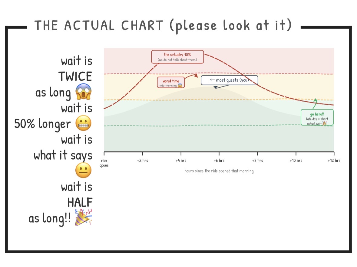
@len I took a shot at translating yours for a non mathy Disney fan. Generally, I think a large percentage of the population forgot everything they learned in 5th grade about fractions, ratios and percentages. I tried to stick to fractions people can picture (1/4 or 1/2) or percentages they see during sales (25%, 50%) and offer more context for the timing. Probably too many words—I’m not super visual but will continue to noodle on it.
I realize it’s statistics and not “luck” but think luck describes how people experience longer or shorter waits.
4 Likes

LOL. I find it quite funny that you wrote this right after quoting me. I can’t stop giggling. TBH, I use math in my job quite a bit. I just absolutely hate probability and statistics.
And BTW, love your sketch.
3 Likes
I wasn’t referring to anyone specifically, I swear!
This is Claude’s version, in the style of the great Allie Brosh (Hyperbole and a Half.) It would be funnier with her pain scale illustrations, but I’m happy that Claude didn’t lift her IP.
3 Likes
I LOL’d here
I love graphs. But I have no idea what this data is trying to tell us.
1 Like
I love graphs, and percents, and ratios, and fractions, and decimals. I can manage probability and stats.
I do not instantly understand what I am looking at with any of these rides graphs.
BUT - I don’t need to. I just need to pay my subscription and let TP tell me when to wait to ride Nemo.
4 Likes
I’d ![]() the graph’s phrase “hover a bucket” but I don’t know what it means…
the graph’s phrase “hover a bucket” but I don’t know what it means…
5 Likes
I had a similar thought yesterday. That is, while I don’t know how I would use this graph, as long as the app tells me the best time to ride, it doesn’t matter!
3 Likes
I’m getting t-shirts made. ![]()
2 Likes
DOES EVERYONE ELSE SEE THIS???!? THIS IS ALL I’M ASKING FOR: Surrender to our robot overlords. ![]()
![]()
I think one of the things I personally want with these graphs is to be able to point folks to them and say “this is how we know when to send you to specific rides”.
5 Likes
Thank you, Mary! Let me see what I can do with this. I like the style. I’m working on this for the next couple of days.
Buy yourself a dinner and send me the receipt, please. I’ll venmo/paypal/zelle/send you a bag of nickles to pay for it.
3 Likes
LOL
Look - I had two amazing WDW vacations last year with not a single LMNOP and used TPs for at least 75% of each day.
I am a true believer.
6 Likes

4 Likes
Oh
It’s validation you want.
There’s a chance you might be in the wrong business.
I haven’t seen anything yet to divert me from zigging when others zag. Seems I read that somewhere . . . ![]()
4 Likes