I am 100% sure I’ve done this at either Disneyland or WDW. Might have been DLR if you’re not seeing it in WDW. That said, it was a little awkward to use.
Yep you are right. I think the difference to me, like you said, is that the MDE map shows actual building depictions where the above proposed TP map just has a color blob to represent walkable areas and buildings, where the slightly darker color is supposed to be the building but it isn’t that much darker than the color used for sidewalk. And then add to that the main sidewalks are white - makes it look like those are the only places you can walk
I’m fine with highlighting different lands, as that corresponds to one of the ways you can have rides listed on TP. But I agree with you that the more colorful map is more confusing than MDE since it is less obvious what are the actual buildings.
2 Likes
I like it! Gives the essentials without being overcluttered, which I appreciate.
A couple of thoughts:
- For the ride names, I understand the impulse to distinguish them from the land names in terms of font color, but some of them can be hard to read. You might consider making the text black for legibility, since that would maintain the difference from land names.
- I appreciate the “just the essentials” approach, but I do think a little more ride iconography might be helpful for orienting people. The Aladdin’s lamp icon is a great example of something small but recognizable that would help someone new to the park get a sense of where they are.
We used Google Maps for walking navigation in the parks in early December because I use it daily and it’s more intuitive than MDE. I didn’t keep good notes so can’t cite the rides, but it was accurate roughly as often as Google Maps to hiking trail heads—maybe 60-70%. Sometimes it would go to someplace completely different from The attraction we entered. Sometimes it to the attraction but not its entrance. And sometimes it worked great! We also used it for finding our car on foot, and for driving between resorts and parks, and found ourselves in cast member only or otherwise restricted areas. TP would need to verify the route was correct and that Google could reliably return the correct directions before relying on it.
I go to the parks maybe every 3-5 years and a lot changes. We thought we studied the maps as park of our park prep, but that was our big note to self (and to family members going in February) — the parks are big and it’s easy to get turned around if you don’t have a strong sense of orientation. I personally love visual cue directions that read/sound like “walk forward until you see the entrance of Winnie the Pooh on you’re left” — and I didn’t get those on foot in the parks.
At one point I wondered out loud if employees of competing parks walk around in WDW all day falsely tagging things to throw Google off. But as a hiker, I know that Google isn’t yet super sophisticated with off road driving or walking directions—and that is more likely than competitor sabotage. ![]()
3 Likes
Hi folks-
We’ve updated this sample MK map based on your feedback. Let me know what you think.
Here’s the overall map. It’s designed to give a big-picture idea of the park. We expect people to only glance at the high-level map before zooming in.
We’ve done the following changes:
- Increased the contrast, for easier reading
- Added more attraction icons
- Added more attraction names
- Added restroom icons
- Updated the look of the trees re: inaccessible areas

Here’s what we have for navigation. The main change here is to fade out the map background, making it easier to see your route.
We still need to call out waypoints on that route.
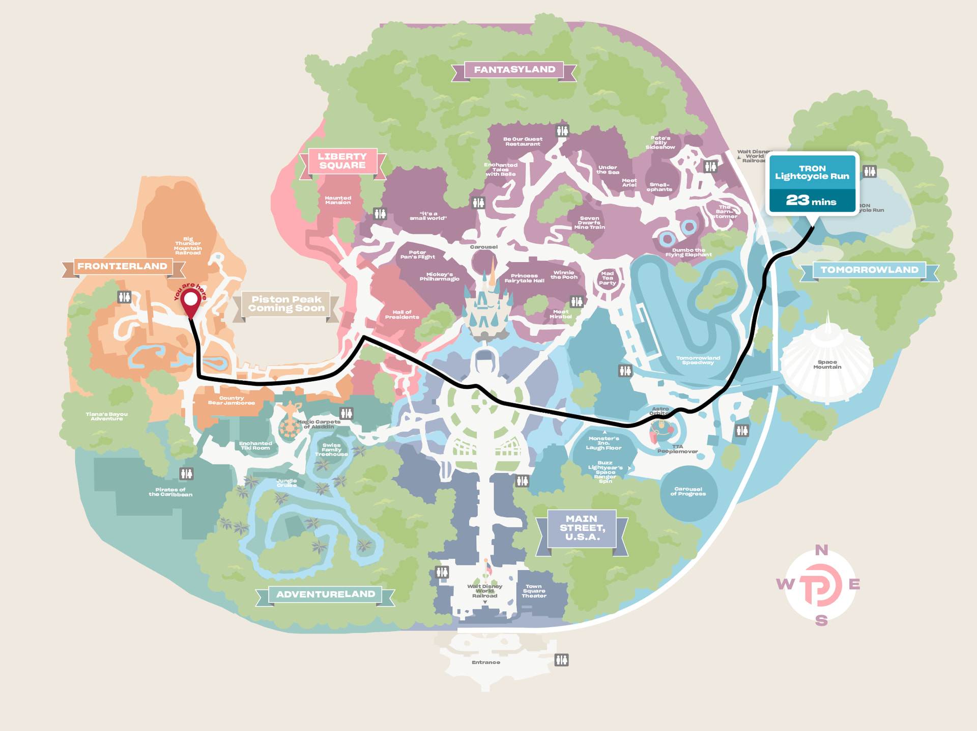
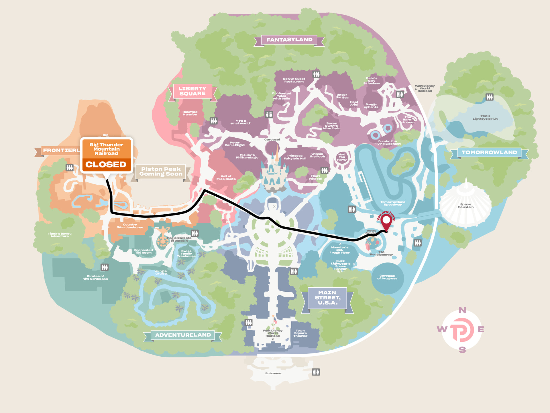
Those images also show how we’re thinking about displaying real-time wait info.
6 Likes
These are looking great to me! I see you’ve added an image for Astro Orbiter, which is a good landmark.
Isn’t that area by the restrooms in Adventureland (by the Swiss Family Treehouse) also a cut-through path from FL/LS side? If so, please show that in white (or something), similar to the cut-through by the Country Bears. I like knowing where shortcuts are! TIA
3 Likes
Love seeing the quickest routes! I feel like it’s always hard to tell on the ground.
4 Likes
Ah, thank you.
One of the things we noticed when looking at Google Maps’ route suggestions is that it wasn’t clear on shortcuts like that. So that’s important.
5 Likes
Is it just me or is the FL RR station somewhat ambiguous on the map?
1 Like
I love these maps! The improvements are great. ![]()
Do you see the little arrow pointing to the station?
1 Like
Yes
Eventually
(keeping in mind my bifocals apparently don’t have xray powers ![]() )
)
I think I was looking for a train station thingy of some sort ![]()
2 Likes
Hopefully in the app you’ll be able to zoom more easily. ![]()
2 Likes
Is the 23 min under Tron the walking time or the wait time?
The changes are great for readibility - love the contrast improvements and the “you are here” change!
1 Like
I understood it to be waiting time based on his comment and the fact that the return trip showed “closed” for BTMRR rather than a time.
Also 23 minutes would be way too long to walk anywhere within MK, even at “very slow” speed. Whereas 23 minute wait is feasible at certain times.
It just seemed like a short wait for Tron! ![]()
I suggest adding small words of “expected wait” or the like to the time box - at least, my brain assumes that is the length of the described path.
I think both the walking time and the expected wait (if the destination is an attraction) would be helpful? Bonus for the walking time being modifiable like in TP (relaxed vs fast etc).
1 Like
Ahh, great question. Let me see if we can clarify that. Thank you!
3 Likes
These look good to me. The little blip on the “Pistons Peak, Coming Soon” sign is bothering me, but that’s a minor issue.
I assume the system knows the timing of parades and such and would detour around the hub if you were going mid parade (or indicate you can’t get there at the moment).
The visuals look good to me. I like that buzz and laugh floor have little arrows indicating where they are in the colored block; assuming those are entrances. Could these be added for things like pirates and jungle cruise? Or Tiana’s, which looks like it’s in the trees.
1 Like
These are looking good, Len. I did just think of something that I would find useful: a different icon for companion bathrooms. As a disabled person, I prefer those, and they can be hard to find.
Will your map be able to be moved manually so that it’s facing the way I’m going? That would be a great help. I had such a hard time with MDE directions. Even if it didn’t do it automatically, being able to rotate myself would be very helpful.
1 Like
Perhaps a couple dotted lines for the Main Street Bypass routes? Usually not open, of course, but when you need them you need them!
2 Likes