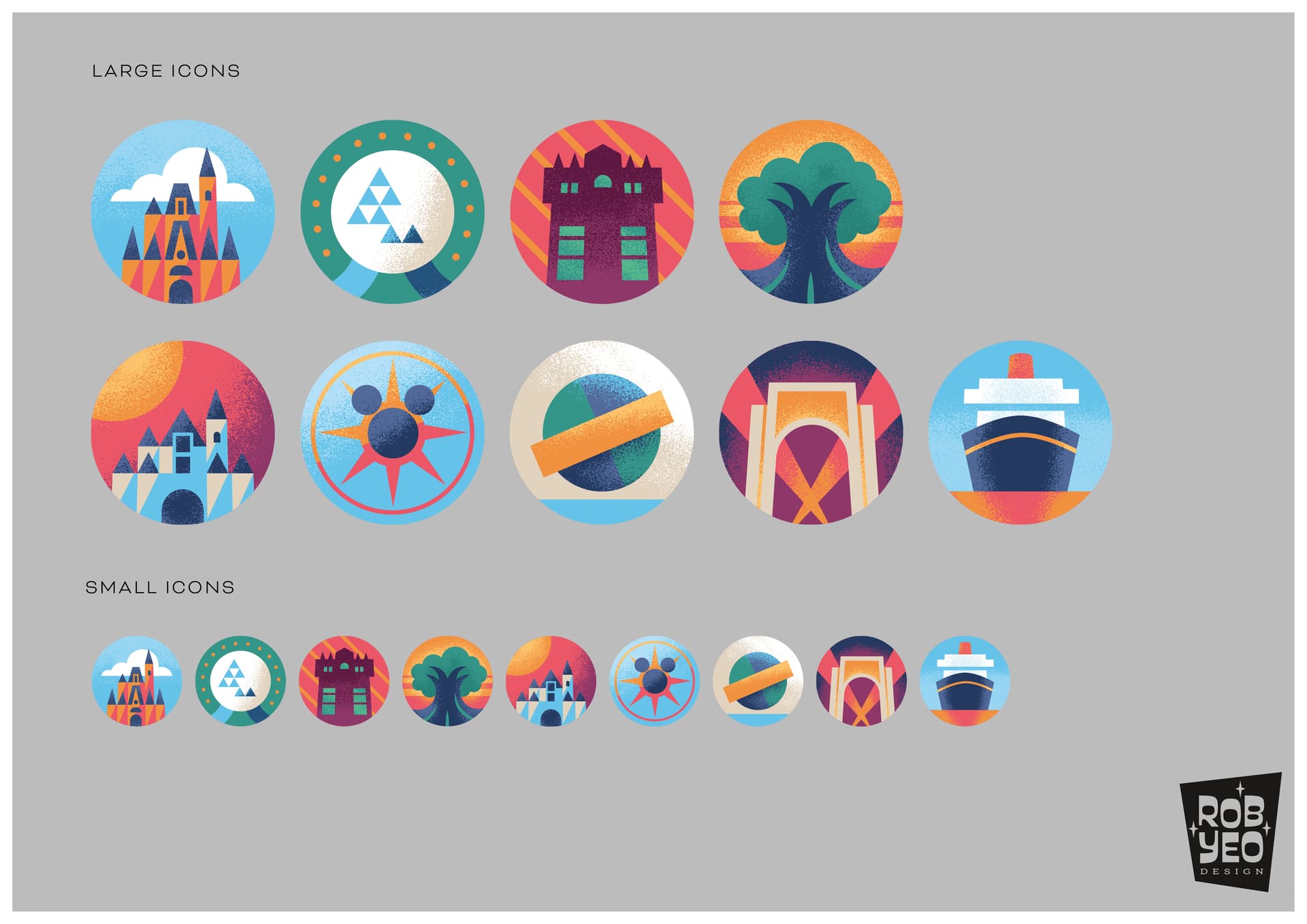
We’ve started a website redesign project. As part of that, we’re designing new icons for each park. Here’s a draft of where we’re at. The top row is WDW parks, the bottom row is DLR, UOR, and DCL.
Constructive feedback is appreciated. Here, “constructive” means “this would be better if you changed/added/removed X (for/instead of Y).”
These are FAB! It did take me a second or two to figure out EC (top row)… maybe add a few more triangles or place very light lines (hint) of triangle patterns on the sphere?
I’ll probably end up a naysayer, but I don’t like these icons. (Well, sort of…they are actually lovely.) But my problem is that they are NOT instantly evocative of what they are intended to mean. They are a bit too abstract. If they were always going to be used on conjunction with descriptive text, perhaps. But I kind of have to “work for” what some of the icons means. (The Epcot one, in particular, I only figured out by process of elimination.)
If that one with the green/blue circle and the horizontal bar is supposed to be the Universal globe, then that would be USF. But the archway is also USF. The entrance for IOA would need to be the lighthouse??? So there are two icons for USF, but not one for IOA?
Also, I think the AK tree would be better to look a little LESS natural. I think it is the trunk that is throwing me off a bit there. (But that one is one I figured out very quickly regardless, so not really a big deal.)
The difference between the MK and DL castles stands out when right beside each other, but I’m not sure they are different enough, particularly for the untrained eye. (Most Liners would know the difference in the castles, but not the average first or second time trip-planner.)
I think they look too much like Wilderness Explorer badges and that the average person isn’t going to connect the images to what they represent very easily
I would consider replacing them with photos of the actual icons.
Edited for more constructive criticism than naked criticism