Thanks for the replies. And yes, I clicked the different date links to get the crowd info.
And I did not see these threads from @len but I will try to be more vigilant in my searches. I looked through the front page of this sub-forum and didn’t notice anything.
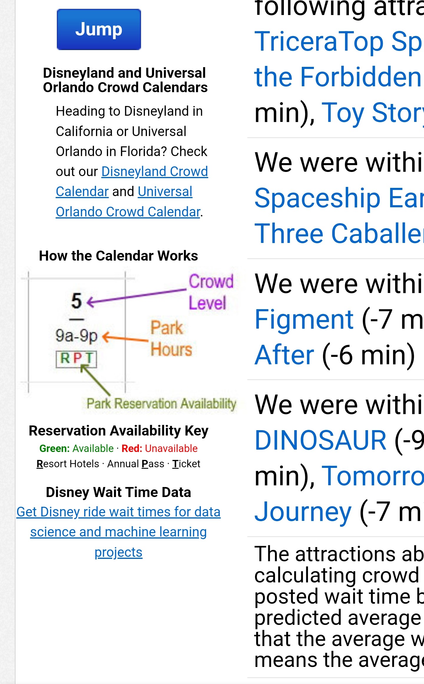
Here is how I use this information:
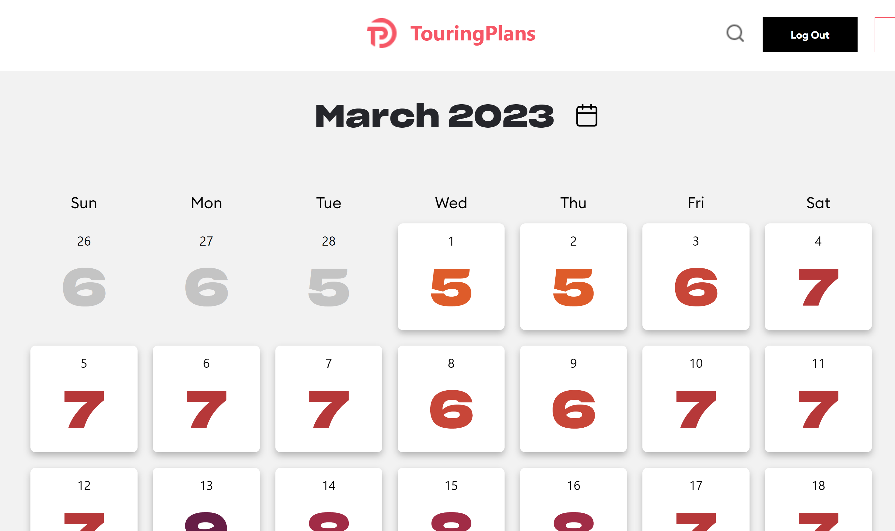
–I am able to quickly copy and paste the crowd calendar data for my selected dates into a small excel file that will convert the numbers into a very handy green, red, yellow color system similar to your hourly heat map concept. The only difference is that mine is by day. I no longer can simply view all the calendar data (crowds, hours, extended evening info, after hours info, etc) in one quick and easy step. It’s now all individually hidden behind a pretty to look at but more onerous calendar interface.
–Once copied and pasted into excel, my conditional formatting takes over. I then place it in google drive and right on the homepage of my phone for easy use while in the parks.
Here is my feedback:
–It takes the user longer to access the complete data because now they have to click each day individually.
–Like Genie+ you have now made it pretty to look at, but heavier by design and thus slower to load. (My internet speeds are nuts, that’s not it).
–Change for change sake is not change… It is merely makeup used to make things look prettier. But now you have wait longer and do more things to access the data you once could get with one simple mouse click and scroll.
–Who is paying for this? And for what purpose are the changes being made if the user experience suffers? Haven’t we learned from Disney’s mistakes already?
Change can be difficult as a poster says above but changing with no tangible benefit other than to make everything look more bright, vibrant, and advanced doesn’t really add to the utility of this website IMO.
And my big fear is that you will be passing on all of this to your users in the form of price hikes and cost increases. That sounds very familiar to what we have all experienced in the parks and my sincere hope is that you will learn from that mistake. Less utility, slower access, higher pricing. That’s my guess.
My hopeful fix to this:
Give your users the option to view the “classic view” when you build this out. That way we have the choice to use the new interface or to stick with that view.
Thanks for the opportunity to weigh in.