As some of you know, TouringPlans is very, very shortly announcing that we are a fully-functional Travel Agency to Disney World and… well, anywhere else. I’ll post here when the web page is active (again, soon!) but for now if you want to quote or book anything you can email the fabulous Annette Jackson at Annette@TouringPlans.com.
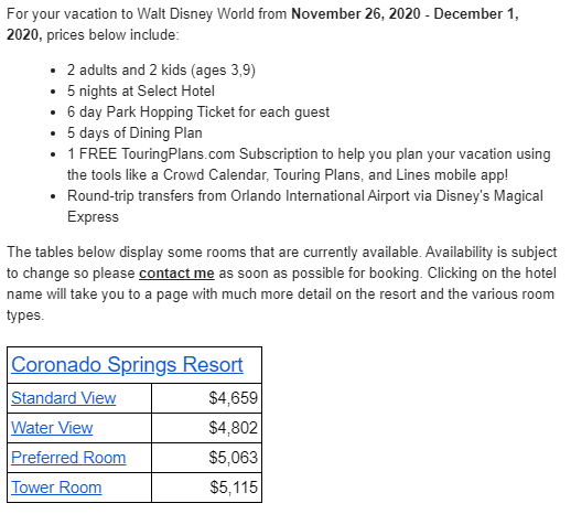
Anyway, that isn’t actually the point of this post. We’re still working on the best way to display price options to potential WDW clients. Below are two versions and I would like you to tell me what you like best. For both options, the numbers next to the room types are the price for the entire vacation. (Also, the quote would, in most cases, contain more than one hotel. The below is an example.) (Oh, and the numbers are not necessarily accurate.)
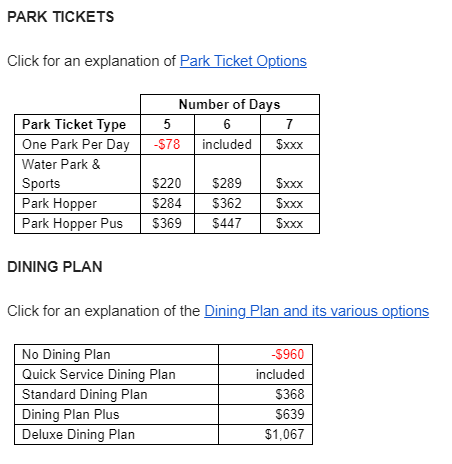
Option 1: This directly compares the costs of different ticket days, and shows no dining plan in the top chart, the QS dining plan in the lower. Other information like different ticket types (Water Parks, Park Hopper Plus, etc) are not displayed.
I agree, option 1 for sure! Much clearer. I also assume this quote would be shown after an explanation (if needed) of different ticket types and dining plans.
I like 2 because it shows me potential upgrades or savings without having to go back-and-forth with the agent.
One item that stuck out to me on option 1 is that the intro text says “prices below include” 5 days of dining plan but then the first prices you see don’t include the DP. They’re there in the second chart but it seemed odd.
The more I look at them, option one is what I am leaning towards. I would like the hyperlinks from option 2 put into option 1. That would reduce the back and forth conversation.
I am also assuming you would have 3rd, 4th and 5th table in option one for the Standard, Plus and Deluxe Dining Plans.
YOu could keep the park ticket days in numerical order like other have suggested, but I would either Bold or Italicise or somehow highlight that the 6-day park ticket is the basis of the quote.
I would be ok with either. I find option 2 to need more careful study, option 1 seems a little easier to understand.
For option 1, I would like a chart showing costs for the DDP.
Option 2 gives more information with the various choices.
I agree for #1 I would want to see charts for each dining plan. You might skip the deluxe but if they bring back 4 plans, at least 3.
#2 would work for me BUT you are counting on clients to interpret and add the different components to understand the final cost. I am afraid that that could create misunderstandings and conflict.

 How can you not want it broken down into all the different variables ?